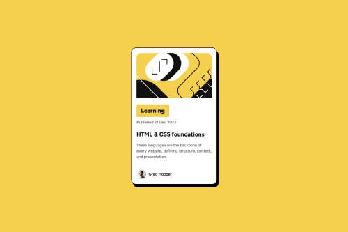
Blog Card Responsive Solution

Solution retrospective
I'm most proud of successfully creating a responsive design that adapts well to different devices.
Next time, I would explore using CSS Grid in combination with Flexbox for more complex layouts and consider adding subtle animations to enhance user experience.
What challenges did you encounter, and how did you overcome them?I encountered challenges with making the card fully responsive without stretching the content. I overcame them by using a combination of Flexbox and proper max-width settings, along with media queries, to maintain the design's proportions on all screen sizes.
I would like help with optimizing the CSS for better performance and maintainability, particularly with using advanced techniques like CSS Grid alongside Flexbox. Additionally, any suggestions for improving the visual design or enhancing the user experience with animations would be appreciated.
Please log in to post a comment
Log in with GitHubCommunity feedback
No feedback yet. Be the first to give feedback on noreenfatima775's solution.
Join our Discord community
Join thousands of Frontend Mentor community members taking the challenges, sharing resources, helping each other, and chatting about all things front-end!
Join our Discord