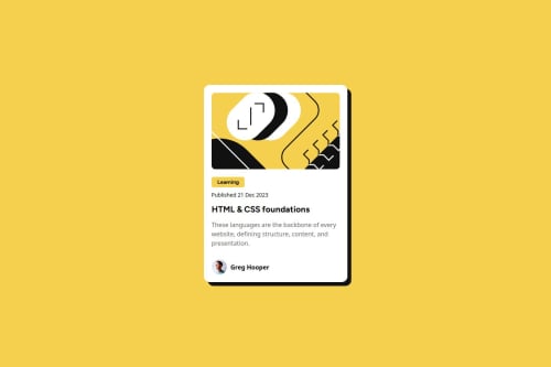
Blog Preview Card - A responsive card component using CSS Flexbox

Solution retrospective
I’m most proud of how the blog preview card maintains its clean design and responsiveness across various screen sizes. Using CSS Flexbox allowed me to structure the layout simply yet effectively. Next time, I’d experiment with CSS Grid to see if it offers any advantages over Flexbox for card-based layouts, and I’d also try incorporating hover animations to improve interactivity.
What challenges did you encounter, and how did you overcome them?One challenge was ensuring proper spacing and alignment on smaller screens, which I fixed by adjusting margins and padding dynamically while using max-width to prevent stretching. Another issue was making hover and focus states smooth and accessible, which I addressed by using CSS transitions to improve the user experience.
What specific areas of your project would you like help with?I’m looking for feedback on improving accessibility, particularly for screen readers. I'd also appreciate suggestions for optimizing my CSS for better maintainability and thoughts on whether CSS Grid might work better for this component than Flexbox.
Please log in to post a comment
Log in with GitHubCommunity feedback
- @shubhamqx
typography can be improved the title should be bold

Join our Discord community
Join thousands of Frontend Mentor community members taking the challenges, sharing resources, helping each other, and chatting about all things front-end!
Join our Discord