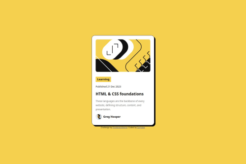
Blog Preview Card - Frontend Mentor Challenge

Solution retrospective
I'm most proud of my ability to implement responsive design using clamp() for fluid font sizes and widths without relying on media queries. It helped me create a smooth and scalable layout. If I were to do this again, I would focus more on optimizing accessibility, perhaps by adding ARIA roles and ensuring all interactive elements are fully accessible. I also want to experiment with using CSS Grid for more complex layouts.
What challenges did you encounter, and how did you overcome them?One challenge I faced was ensuring that all hover states were consistent across different screen sizes. To solve this, I carefully reviewed the CSS properties and adjusted the font sizes and element spacing using clamp() and rem units to ensure better responsiveness. Another challenge was refining the layout's responsiveness on mobile, which I addressed by using a mobile-first approach and applying Flexbox to achieve a clean and responsive design.
What specific areas of your project would you like help with?I’d love feedback on the following:
How I can further improve accessibility on the page—specifically if there are any better practices for enhancing screen reader compatibility. Any suggestions for improving the CSS structure, such as using pre-processors like SASS or organizing the code better to avoid redundancy. Recommendations for ensuring cross-browser compatibility, especially on older bro
Please log in to post a comment
Log in with GitHubCommunity feedback
No feedback yet. Be the first to give feedback on Carliytox's solution.
Join our Discord community
Join thousands of Frontend Mentor community members taking the challenges, sharing resources, helping each other, and chatting about all things front-end!
Join our Discord