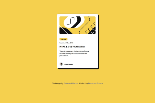
Blog preview card - Mobile-first workflow - Flexbox

Solution retrospective
I'm proud of how I managed to build a clean and responsive layout using semantic HTML and CSS, following a mobile-first approach.
Next time, I would structure my CSS more efficiently from the beginning to avoid repeated styles in media queries. I learned to separate mobile and desktop styles better.
What challenges did you encounter, and how did you overcome them?At first, I was duplicating CSS properties from the mobile view into the media queries. It made the code harder to maintain and caused spacing issues. I solved this by organizing my styles with the help of VSCode's split editor, which let me compare sections side by side and remove redundancies.
I also struggled with using fixed width and height, which led to a rigid layout. I learned to rely more on max-width, padding, and margin to achieve a more flexible and responsive design.
What specific areas of your project would you like help with?I’d love feedback on my CSS structure—especially how to better organize base styles vs. media queries. Any advice on improving code readability and best practices for scalable responsive design would be very appreciated.
Please log in to post a comment
Log in with GitHubCommunity feedback
- @Monish9393
looks good but the space between the learning tag and the card image is slightly large but overall it is good

Join our Discord community
Join thousands of Frontend Mentor community members taking the challenges, sharing resources, helping each other, and chatting about all things front-end!
Join our Discord