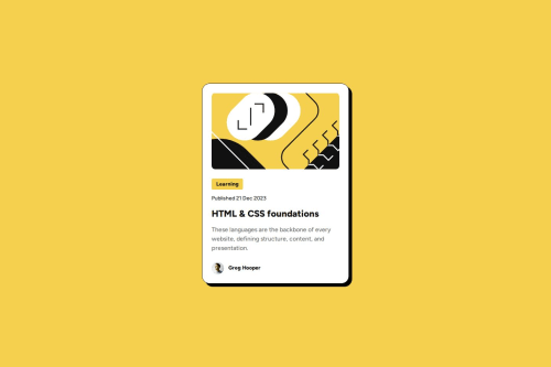
Blog Preview Card - semantic HTML, modern CSS layout techniques.

Solution retrospective
’m most proud of how I implemented a fully responsive design using Flexbox and CSS Grid, which allowed the blog preview card to adapt seamlessly across different screen sizes and devices. I also took care to use semantic HTML5 elements to improve accessibility and maintain a clean structure. Additionally, I’m happy with how I used CSS transitions and pseudo-classes like :hover and :focus to create smooth interactive effects that enhance the user experience.
If I were to do this project again, I would spend more time organizing my CSS code to follow best practices and improve maintainability. Also, I’d like to deepen my understanding of CSS animations, transformations, and pseudo-classes to create even more engaging interactions.
What challenges did you encounter, and how did you overcome them?One challenge was mastering the clamp() function to create fluid and scalable typography and element sizing. I overcame this by breaking down the calculations and adapting existing formulas to fit the project’s needs, which helped me gain a better grasp of fluid design techniques.
Another challenge was ensuring fonts were imported correctly from local sources instead of relying on external links. This required me to learn the correct CSS structure for font imports, which ultimately improved the project’s independence and performance
What specific areas of your project would you like help with?I would appreciate help or resources on best practices for organizing CSS code more efficiently. Also, guidance on advanced CSS pseudo-classes, animations, and transformations would be very valuable as I aim to deepen my skills and create more dynamic UI interactions.
Please log in to post a comment
Log in with GitHubCommunity feedback
- @thisisharsh7
Great job! Here’s some feedback to help you improve:
What’s Working Well:
- ✅ Excellent use of Flexbox and CSS Grid for responsiveness.
- ✅ Semantic HTML structure enhances accessibility.
- ✅ Smart use of
clamp()for fluid typography – very modern!
Suggestions for Improvement:
- 🔄 Consider grouping your CSS logically using sections or comments like
/* Typography */,/* Layout */, etc. for better maintainability. - 🧱 The CSS file is robust but could benefit from utility classes or even a CSS methodology like BEM for scalability.
- 🎯 The
mainisheight: 100vh, which could cause issues on smaller screens. Maybe switch tomin-height: 100vh. - 🎨 Add
cursor: pointerto interactive elements like.card-containerto indicate interactivity. - 🎥 Explore
transform,scale(), and keyframe@animationsto enhance interactions further.
💡 Tip: To level up your CSS skills, check out CSS TRICKS.
Overall, you’ve built a solid foundation — with a few tweaks and deeper animation skills, this project could shine even more!
- @Javeria-kanwal
I'm really impressed with how you’ve approached responsiveness using Flexbox and Grid — it’s clear you’re building a strong foundation. Your use of semantic HTML and attention to accessibility is also commendable, as it shows long-term thinking.
I like that you experimented with clamp() and local font imports — both can be tricky at first, but you handled them well and learned from the process.
For next time, organizing your CSS and diving deeper into animations/pseudo-classes is a great focus. I’d suggest looking into methodologies like BEM or using tools like Sass for structure, and maybe checking out resources like CSS Tricks or MDN Web Docs for more advanced styling techniques.


Join our Discord community
Join thousands of Frontend Mentor community members taking the challenges, sharing resources, helping each other, and chatting about all things front-end!
Join our Discord