
Solution retrospective
Most of the design look clean of first try
What challenges did you encounter, and how did you overcome them?Not many challenges, had to rewrite some of the code because of bad practices but the design was easy.
What specific areas of your project would you like help with?Any feedback on good practices would be good.
Please log in to post a comment
Log in with GitHubCommunity feedback
- @bccpadge
Hello @Jonee2. Congratulations on completing this challenge!!!🎉
You can wrap the the
imgand name in adivand then useflexboxto align them. Be sure to change theh3to ah2because heading tags must be used in chronological order. You can usegapproperty to add space between the elements as well.div{ display: flex; align-items: center; }I hope you find this useful and don't hesitate to reach out if you have any questions.
- @grace-snow
This needs a lot of the same changes as your QR code solution. Apply those here.
The only additional issues I note are:
- if using inline svgs they need to either be aria-hidden if they are decorative images, or they need to be accessibly named. This article explains different ways to accessibly name svgs smashingmagazine.com/2021/05/accessible-svg-patterns-comparison. Although, personally I would just use an img tag here.
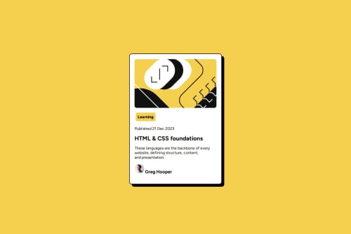
- There is no link to the blog, which would make this card unusable. Whenever you see a hover style in a design that means something is interactive (clickable). It's our job as frontend developers to choose the appropriate element depending on what the click would do. In this case it would navigate to a blog post, which means the element must be an anchor (link).
- I think this design showed that the whole card should be clickable in this case. That means you'd need to use the content-pseudo trick on the link when you add it, as explained on the inclusive components site
- Don't use <br> to try and create vertical space. Use margin.
- @Anass-Lamiri
Hi, I suggest you make the profile pic and the name in a div and then make a display flex, with a align-item center.
    display: flex;
    align-items: center;
    gap: 16px;
you can adjust the gap according to the design.
I hope this feedback is helpful.


Join our Discord community
Join thousands of Frontend Mentor community members taking the challenges, sharing resources, helping each other, and chatting about all things front-end!
Join our Discord