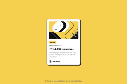
Blog Preview Card

Solution retrospective
I am proud I was able to complete this project as close to the design as intended. I was glad I was able to closely replicate the desktop, mobile, and active states of the designs. The only part of the challenge I had issues with was changing the font-sizes when going from desktop to mobile, without the use of media queries. I am sure the solution to this is something easy I overlooked, as I attempted using the new CSS feature container-name and @container (max-width ), however I was not successful. Any pointers on that part would be greatly appreciated.
What challenges did you encounter, and how did you overcome them?Aside from the remaining challenge mentioned above regarding the font size changing, I was glad to overcome an issue with resizing the svg image in mobile vs desktop by utilizing the object-fit property.
What specific areas of your project would you like help with?How can I make font-size changes more fluid yet still specific to a size based off a container (without using a media query)? For example, if the card size in desktop has a width of 384px and a paragraph text is 16px, then when the card shrinks to 327px, the text shrinks to 14px?
Please log in to post a comment
Log in with GitHubCommunity feedback
No feedback yet. Be the first to give feedback on Sunil's solution.
Join our Discord community
Join thousands of Frontend Mentor community members taking the challenges, sharing resources, helping each other, and chatting about all things front-end!
Join our Discord