


@Islandstone89
Posted
HTML:
-
Every webpage needs a
<main>that wraps all of the content, except for<header>andfooter>. This is vital for accessibility, as it helps screen readers identify a page's "main" section. Wrap the card in a<main>. -
I would use the
<time>element for the date:<p>Published <time datetime="2023-12-21">21 Dec 2023</time></p>. -
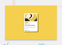
The heading would have a link inside, as this is a blog card.
-
Screen readers automatically announce
<img>as an image, so you shouldn't have words like "image" or "photo" in the alt text. A suitable alt text for the profile image would be "Headshot of Gary Hooper". -
.attributionshould be a<footer>, and you should use<p>for the text inside.
CSS:
-
Including a CSS Reset at the top is good practice.
-
font-sizeandfont-weightshould be placed on thebody, not the*. You do not need to declarefont-size: 1rem, as that is the default value. -
Add around
1remofpaddingon thebody, so the card doesn't touch the edges on small screens. -
Remove the media query, it is not needed. Replace
widthon the card withmax-width: 20rem. -
I would remove the positioning and transform properties on
.attribution.
@Benjihunt97
Posted
@Islandstone89 thanks for your comment. I didn't use a main tag as this is a small 1 component challenge. Also I did reset styling below the root. I prefer to add my custom styles at the start then have my prefix styling.
Also I add the font-size in the * to target everything including the h1-h6 tags so I can full control over the sizes, same for the font-weight. I got the idea as I use tailwind css.
Also which browser did you view it in mobile for as it's been working fine for me. On chrome and Firefox.
@Islandstone89
Posted
@Benjihunt97 Always use a <main> element when you have anything besides <header> or <footer> :)
Remember to add max-width: 100% on images as part of your CSS Reset - the max-width prevents it from overflowing its container.
I don't use Tailwind, so I can't comment on that.
I usually like to add some padding on the body for components like these. I haven't checked your page in mobile.
All the best :)
