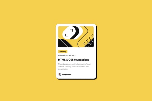
Skip to content
  • Unlock Pro
  • Log in with GitHub
Solution
Submitted about 1 year ago

Blog Preview Card

LeandroJr730•60
@LeandroJr730
A solution to the Blog preview card challenge
View live sitePreview (opens in new tab)View codeCode (opens in new tab)

Solution retrospective


What are you most proud of, and what would you do differently next time?

I am proud of making the website "work" on mobile devices by my own, just by searching the basics on the internet. I need to learn how to use semantic tags better, so my code is easier to read.

What challenges did you encounter, and how did you overcome them?

I spent a lot of time trying to get the perfect margins, paddings, etc. I should do it faster and focus more on other things. I also struggled to make my website work on mobile devices but it ended up kind of working.

What specific areas of your project would you like help with?

I need to use better semantic tags and improve the way my website is displayed in mobile devices.

Code
Select a file

Please log in to post a comment

Log in with GitHub

Community feedback

  • Grego•1,430
    @Grego14
    Posted about 1 year ago

    Hello! I have been reading your HTML code and here I leave you some recommendations to make your code more semantic.

    You are using a <summary> element to create a "tag" or a button, and that is not what that element is used for, here is a link for you to read more about it Summary

    Now I would replace that <aside> element with a <span> or a <p> element.

    And for the text below I recommend using a <p> element again and not a <section>

    You can use a <span> element in the Greg Hooper text.

    summary{
      padding-left: 13px;
      padding-right: 13px;
      padding-bottom: 5px;
      padding-top: 5px;
    }
    

    In this case it is not necessary to place the padding 4 times since the top and bottom are the same value and the right and left are the same.

    summary{
      padding: 5px 13px;
    }
    

    The first value would be for top and bottom and the second for right and left.

    I also recommend changing the height in that media query:

    @media only screen and (max-width: 375px) {
      .box{
        /* height: 65%; */
        min-height: 65%;
      }
    }
    

    Since it can cause overflow on smaller screens. But for that to work you must also change the height that you placed on the .box element from the beginning.

    .box{
      /* height: 520px; */
      min-height: 520px;
    }
    

    This way you make sure that the height of the element is 520px but also that it can increase if necessary.

    I hope this helps!

    Marked as helpful
  • Bryan Li•3,530
    @Zy8712
    Posted about 1 year ago

    Hi there! Your site looks pretty good.

    Some things I would recommend you to change/modify with your code:

    • you should use a heading tag like <h1> for the title of the card and you should also use a <p> paragraph tag for the text of the card. This is primarily for semantic and accessibility purpsoes
    • for <img> tags you can leave the alt decription empty like alt="" as descriptions are mainly used for images that convey some important information. So decorative images can be left empty

    Aside from these two things, you've got solid code structure 👍

    Marked as helpful

Join our Discord community

Join thousands of Frontend Mentor community members taking the challenges, sharing resources, helping each other, and chatting about all things front-end!

Join our Discord
Frontend Mentor logo

Stay up to datewith new challenges, featured solutions, selected articles, and our latest news

Frontend Mentor

  • Unlock Pro
  • Contact us
  • FAQs
  • Become a partner

Explore

  • Learning paths
  • Challenges
  • Solutions
  • Articles

Community

  • Discord
  • Guidelines

For companies

  • Hire developers
  • Train developers
© Frontend Mentor 2019 - 2025
  • Terms
  • Cookie Policy
  • Privacy Policy
  • License

Oops! 😬

You need to be logged in before you can do that.

Log in with GitHub

Oops! 😬

You need to be logged in before you can do that.

Log in with GitHub

How does the accessibility report work?

When a solution is submitted, we use axe-core to run an automated audit of your code.

This picks out common accessibility issues like not using semantic HTML and not having proper heading hierarchies, among others.

This automated audit is fairly surface level, so we encourage to you review the project and code in more detail with accessibility best practices in mind.

How does the CSS report work?

When a solution is submitted, we use stylelint to run an automated check on the CSS code.

We've added some of our own linting rules based on recommended best practices. These rules are prefixed with frontend-mentor/ which you'll see at the top of each issue in the report.

The report will audit 1st-party linked stylesheets, and styles within <style> tags.

How does the HTML validation report work?

When a solution is submitted, we use html-validate to run an automated check on the HTML code.

The report picks out common HTML issues such as not using headings within section elements and incorrect nesting of elements, among others.

Note that the report can pick up “invalid” attributes, which some frameworks automatically add to the HTML. These attributes are crucial for how the frameworks function, although they’re technically not valid HTML. As such, some projects can show up with many HTML validation errors, which are benign and are a necessary part of the framework.

Oops! 😬

You need to be logged in before you can do that.

Log in with GitHub

Oops! 😬

You need to be logged in before you can do that.

Log in with GitHub