
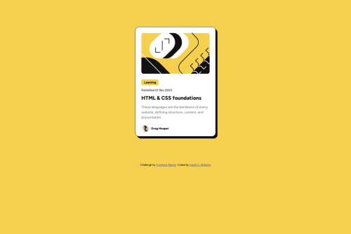
Solution retrospective
I utilized some CSS variables for the main colors to make implementing the color design easier. Relatively easy project for my beginning skill level, although I drew a blank on some CSS properties like "font-style". I wrote "text-style" instead and was wondering why it didn't work. End up not using it after.
ALL IN ALL, check out my version and code. Would appreciate it. Thank you guys.
Please log in to post a comment
Log in with GitHubCommunity feedback
- @Abed001
Hello good job, I know that there are a lot of comments here but there is also one thing to add which is the active state when the card hovers the shadow should become bigger you can use something like this resource: https://www.freecodecamp.org/news/css-box-shadow-property-with-examples/
and also this is the code i have used : .cardshadow{ box-shadow: 10px 10px rgba(0,0,0);
} .cardshadow:hover { box-shadow: 15px 15px rgba(0, 0, 0); /* Increase shadow size and opacity on hover */ } keep going!!
Marked as helpful - @Blackpachamame
Greetings mate!
I leave you the following comments that may help you improve your code:
- Apply display: block to the image to remove that annoying white space
- To center the content you can use
gridin thebody, as follows:
body { width: 100vw; min-height: 100vh; box-sizing: border-box; font-family: 'Figtree', sans-serif; font-size: 18px; background-color: var(--primary); display: grid; place-content: center; gap: 20px; /* Leave a space between your article and your footer */ } article { background-color: var(--white); width: 280px; height: 400px; /* margin: 110px auto; You don't need this anymore */ padding: 1.5rem; border: 1px solid black; border-radius: 15px; box-shadow: 7px 8px 1px black; }Marked as helpful - P@danielmrz-dev
Hello Isaiah!
Your solution looks great!
I have two suggestions for improvement:
- First: For semantic reasons, replace your
articlewithmain. The tagarticlewould make more sense if the card was part of a bigger website (and it certainly would in real world), but since it is all we have on the screen, you can usemain.
This tag change may have little or no visual impact but they make your HTML code more semantic and improve SEO optimization as well as the accessibility of your project.
- Second: I noticed that you used
marginto place the card in the middle of the page. Here's a very efficient (and better) way to center the card:
You can apply this to the body (in order to work properly, you can't use position or margins):
body {
    min-height: 100vh;
    display: flex;
    justify-content: center;
    align-items: center;
}
I hope it helps!
Other than that, great job!
Marked as helpful - First: For semantic reasons, replace your
- @MelvinAguilar
Hello there 👋. Good job on completing the challenge !
I have other suggestions about your code that might interest you.
- The
<figure>tag should be used only when captions are required with<figcaption>. In this challenge, it is not required.
-
Use
min-height: 100vhinstead ofheight. Setting the height to 100vh may result in the component being cut off on smaller screens, such as a mobile phone in landscape orientation. -
Using
width: 100vwgenerates an unnecessary horizontal scrollbar on some screens. So you can remove it.
I hope you find it useful! 😄 Above all, the solution you submitted is great!
Happy coding!
- The
- @turanarican2022
All the above comments make sense and I wanna add something. There is another value for min-height. It is 100svh instead of 100vh. It helps mobile devices to show all the content even while some of the screen is occupied with top bar of the browser. You can search YouTube for Kevin Powell's video on this.
Happy coding!


Join our Discord community
Join thousands of Frontend Mentor community members taking the challenges, sharing resources, helping each other, and chatting about all things front-end!
Join our Discord