
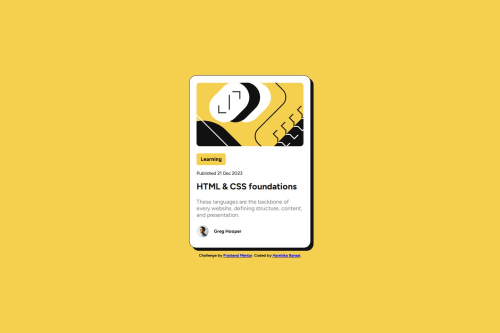
Solution retrospective
I'm most proud of how clean and faithful my solution is to the original design. I ensured the card stays visually consistent across all screen sizes without compromising on layout or readability. I'm also proud that I maintained the semantic structure and kept the CSS modular, which made the project easy to maintain and update.
If I were to do it differently next time, I’d set up the project with a build tool like Vite or use Sass for better CSS organization and scalability. I’d also explore adding subtle animations to enhance the user experience and make the card feel more interactive. Lastly, I’d challenge myself to make the component dynamic by integrating it with JavaScript or a framework like React.
What challenges did you encounter, and how did you overcome them?One of the main challenges I faced was ensuring the card remained fixed in size while still being responsive on all screen sizes. Initially, the card would shrink on smaller devices due to incorrect use of width properties in media queries. I resolved this by setting a fixed width on the card and adjusting the body’s padding and layout instead of changing the card itself.
Another challenge was centering the card both vertically and horizontally without breaking the layout on mobile. I overcame this by using Flexbox on the body element and adding consistent padding to prevent the content from touching the screen edges.
These issues taught me the importance of using layout utilities like flex thoughtfully and being cautious with how media queries alter element sizing.
What specific areas of your project would you like help with?I'd love feedback on how to improve the structure and efficiency of my CSS. Specifically:
-
Are there better ways to handle responsiveness without writing extra media queries that affect card layout?
-
Could I have structured my CSS classes or variables in a more reusable or scalable way?
-
Are there best practices I missed when implementing hover and focus states for accessibility?
Also, if there are more modern layout techniques (e.g., using clamp() for font sizing or container queries), I’d appreciate pointers on how to apply those to small projects like this.
Please log in to post a comment
Log in with GitHubCommunity feedback
- @MarziaJalili
Beautiful work! 🔥
🌟 A tiny point on semantics?
✅ First, headings should follow a logical (ordinal) structure for accessibility and SEO purposes. You're skipping <h2>, jumping from <h1> to <h3>, which is not semantically correct, buddy.
h1 → h2 → h3 → h4 → h5 → h6I've never seen all of these used in one project, anyway. 😅
✅ Second, the author’s name is not meant to be a subheading (not a section title), so you could even use a <p> or <span> instead to represent a label not a heading:
<p class="author-name">Greg Hooper</p>The web's looking great overall — keep up the grind! 💪😎🥇
Marked as helpful - @Esabdul
You are using a <button> for a non-interactive label ("Learning"), semantically, this should be a <span> or <div>, or at least styled anchor if it's meant to be clickable.
Second, there's no hover effect on the whole .card, only on .card-content, but since .card wraps only that one element, it feels bit redundant, you can merge them or remove the outer wrapper.
Also, In your media queries, instead of repeating padding logic, you could use clamp() for font sizes and set some base padding for .card-content and override only where needed.
Also, don't set height: 100vh on html, body, it can cause issues on mobile instead Use min-height.
Lastly, your box-shadow on .card-content:active flips direction, which can feel jarring, consider using a subtle shadow inset or reduce the effect for smoother UX.
Marked as helpful


Join our Discord community
Join thousands of Frontend Mentor community members taking the challenges, sharing resources, helping each other, and chatting about all things front-end!
Join our Discord