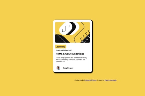
Blog preview card

Solution retrospective
Fico feliz de conseguir começar a andar nos projetos, apesar de sentir que tem muita coisa diferente de muitos que eu vi, ainda sigo em frente e logo mais eu acabo refazendo e melhorando os que eu já fiz.
What challenges did you encounter, and how did you overcome them?Ainda sigo com dificuldade em alinhas alguns itens no css, mas acho que é falta de olhar novamente sobre flexbox entre outras coisas, vou me dedicar mais para conseguir otimizar e melhorar isso.
What specific areas of your project would you like help with?sempre espero que alguém me diga as melhores formas de resolver os problemas, no caso me dar um norte para aquilo que eu fiz, e como eu poderia ter feito.
Please log in to post a comment
Log in with GitHubCommunity feedback
- @R3ygoski
Olá Maurício, parabéns pela conclusão do projeto.
Bom, alguns dos usuários falaram como você pode resolver o problema que você estava tendo, então vou me concentrar na parte mais "teórico" do problema que você teve.
Sobre o Flexbox, ele é utilizado sempre no elemento pai, vamos supor um HTML dessa forma:
<div class="container"> <div class="children"> <div/> </div>
Nesse caso, vamos supor que você queira alinhar o
div.children
nodiv.container
, para fazer isso, você usaria umadisplay:flex
no.container
, e daí bastaria alinhar em cada eixo, que no caso seriaalign-items: center
ejustify-content: center
. Note que também tem uma propriedade, que é aflex-direction
, ela aceita 4 valores, mas vamos nos atentar a dois deles,row
ecolumn
.Cada um deles muda a direção do alinhamento do Flex, e isso também altera os eixos de posição
align-items
ejustify-content
, pois antes o que era usado para alinhar verticalmente passa a alinhar horizontalmente.Como esse é um tema que pode ser um pouco grande, recomendo que veja alguns vídeos para poder pegar a ideia. Vou recomendar três vídeos que podem te ajudar.
E é isso, caso tenha ficado qualquer dúvida, por favor, sinta-se convidado a perguntar aqui. Tentarei ajudar da melhor forma possível.
Marked as helpful - @hitmorecode
Congratulations it looks good. There are a few things for you to fix.
- If you add flexbox on the body it will place the content in the center of the page.
body { background-color: hsl(47, 88%, 63%); /* add these lines */ display: flex; flex-direction: column; justify-content: center; align-items: center; min-height: 100vh; }
- If you add padding on the card, you don't have to add margin or padding on the elements to create space on the left and right side. Only use margin to create space on the next row.
.cartao { width: 386px; height: 522px; background-color: hsl(0, 0%, 100%); display: flex; flex-direction: column; /* margin: auto; remove this line */ /* margin-top: 200px; remove this line */ border-radius: 20px; box-shadow: 7px 7px 1px rgb(0, 0, 0); /* add these lines */ margin-bottom: 50px; padding: 20px; }
- If you add flexbox on the body, you can remove this CSS rule.
// you can remove this entire rule. /* .attribution { margin-top: 60px; margin-left: 730px; padding: 10px; } */
I hope you find this helpful. Keep it up 👍👌
Marked as helpful - @saul-gustavo
Hello, I saw your code, I understand what you did for this challenge, I solved this challenge by putting the following styles:
body { background-color: hsl(47, 88%, 63%); display: flex; align-items: center; justify-content: center; width: 100%; min-height: 100vh; } .cartao { width: 450px or 500px; padding: 2rem or 2em; }
This centers all the content of the letter, and for the image you can use the display property: block;
Happy Coding!! Good Job!!
Marked as helpful
Join our Discord community
Join thousands of Frontend Mentor community members taking the challenges, sharing resources, helping each other, and chatting about all things front-end!
Join our Discord