
Solution retrospective
I am proud of the following achievements in completing the project:
- Utilizing Flexbox to precisely arrange elements and add spacing, which significantly improved the layout of the page.
- Implementing an aesthetic animation triggered when hovering over card links, adding interactivity and a modern feel to the design.
- Completing the project in a short time frame, demonstrating good time management and efficient work organization.
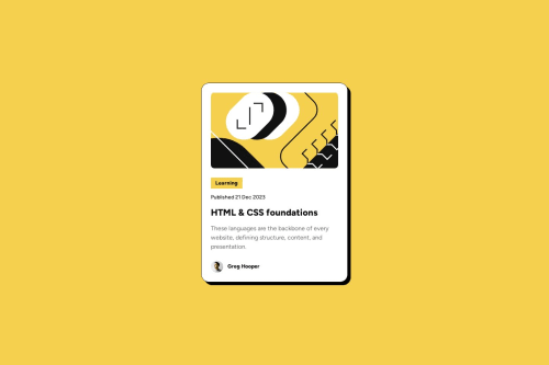
I struggled to set the background for the category name so that it covered only its content rather than the entire line.
Solution: The issue was resolved by adding an additional div element around it.
I couldn't make the font size adjust automatically without using media queries.
Solution: I ended up using the @media (max-width: 376px) rule because the header broke into two lines on smaller resolutions, which looked unappealing.
Is there a way to make font size adjust automatically based on screen size without using media queries?
2. Code Quality AssessmentAre the class names, comments, and overall readability of my code at a high level? What improvements can I make?
3. Project ResponsivenessIs the project adequately responsive and visually appealing on various devices?
Please log in to post a comment
Log in with GitHubCommunity feedback
- @Antonio-Manoel-S
You did identical! My code is too robust, i use px and stuff. Align things is a suck, so i did in any old way, but you did much more identical.

Join our Discord community
Join thousands of Frontend Mentor community members taking the challenges, sharing resources, helping each other, and chatting about all things front-end!
Join our Discord