Submitted 7 months agoA solution to the Blog preview card challenge
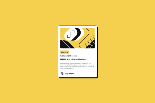
Blog preview card
animation

@hepinsuthar
Solution retrospective
What are you most proud of, and what would you do differently next time?
What I'm proud of
I'm particularly proud of how I:
- Implemented responsive design with a mobile-first approach, ensuring the card looks great on all devices.
- Used Flexbox for the layout, which helped me align elements efficiently and maintain a clean structure.
- Created interactive hover effects that enhance the user experience and make the card feel dynamic.
- Focused on accessibility by using semantic HTML tags, which helps with both readability and SEO.
What I would do differently next time
Next time, I would:
- Add smooth transition effects to hover states for more fluid animations and interactions.
- Use a CSS framework like Tailwind CSS to streamline my styling process and make it more scalable.
- Implement dark mode and theming support, allowing users to switch between light and dark modes.
- Test on more devices and screen sizes to ensure a flawless, consistent experience.
Challenges I encountered and how I overcame them
While working on this project, I faced a few challenges, but I was able to overcome them:
1. Responsive Design Issues- Challenge: Initially, I struggled with making sure the layout worked well on both mobile and desktop devices. Ensuring that the card's elements resized properly was tricky.
- Solution: I followed a mobile-first approach and used
max-widthfor the card and percentage-based widths for its child elements. Flexbox also helped in maintaining alignment and spacing across screen sizes.
- Challenge: Adding hover states to make the card feel interactive without making it too flashy was difficult at first.
- Solution: I focused on subtle color changes and transitions to maintain a smooth user experience, using
:hoverstates with color changes and transitions for smoother interactions.
- Challenge: Ensuring the images maintained their aspect ratio while fitting the card layout was difficult at times.
- Solution: I used
width: 100%andborder-radius: 10pxon the images to maintain the aspect ratio and give them a consistent look across different screen sizes.
- Challenge: Aligning the avatar and name in the author section with Flexbox while maintaining consistent spacing was tricky.
- Solution: Flexbox made it easier to align the avatar and author name in a row. I also used
align-items: centerto ensure both elements were vertically aligned correctly.
Help Needed
I would appreciate feedback and help with the following areas:
1. Optimizing the Card Layout for Larger Screens- I’ve made the layout mobile-first, but I’m unsure if it looks as good on larger screens, especially in terms of spacing and scaling. Can anyone provide suggestions on improving its responsiveness for desktop devices?
- While I’ve added hover states to the title and tag, I’d love suggestions on how to make the hover effects smoother and more visually appealing. Specifically, I want to add a transition to the hover state on the card title for a smoother interaction.
- I’ve tried to ensure the images scale properly on various devices, but I’m wondering if there’s a more efficient way to ensure they don’t get distorted or stretched. Any best practices for responsive image handling?
- If anyone has any other suggestions or feedback on how to improve my code structure, readability, or any other part of the project, I’d really appreciate it!
Code
Loading...
Please log in to post a comment
Log in with GitHubCommunity feedback
No feedback yet. Be the first to give feedback on HepinSuthar's solution.
Join our Discord community
Join thousands of Frontend Mentor community members taking the challenges, sharing resources, helping each other, and chatting about all things front-end!
Join our Discord