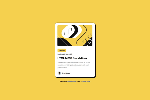
Blog preview card (HTML & CSS only)

Solution retrospective
Since is my second project, I like it!
What challenges did you encounter, and how did you overcome them?I found it quite difficult to make the main image (illustration-article.svg) fit the project requirement on the 'mobile-design' side. For some reason, the image is displayed in the browser at a height of 181px, whereas in reality, it should be 201px! Any help is welcome!
What specific areas of your project would you like help with?As I mentioned, on the 'mobile-design' side, the main image does not fit the requirement. I must be missing something, I assume...
Please log in to post a comment
Log in with GitHubCommunity feedback
- @MelvinAguilar
Hello there 👋. Good job on completing the challenge !
I have some suggestions about your code that might interest you.
Alt text 📷:
-
To make the alt attribute as useful and effective as possible, avoid using words such as "image", "photo", or "picture" as they are redundant because the image tag already conveys that information. Also, the
altattribute should not contain underscores or hyphens. Instead, try to make the description as human-readable and understandable as possible.- For a photo of a person, use their name as the alt text
If you want to learn more about the
altattribute, you can read this article. 📘.
CSS 🎨:
- Simply use max-width: 400px in your component. This eliminates the need for using a percentage width and a media query to adjust the width.
- Avoid using
position: absoluteto center an element as it may result in overflow on some screen sizes. Instead, utilize the flexbox or grid layout for centering. Get more insights on centering in CSS here here 📘.
I hope you find it useful! 😄 Above all, the solution you submitted is great!
Happy coding!
Marked as helpful -
- P@Alexandra2888
Hello! Congrats for finishing the challenge! Here are some suggestions:
- implement BEM naming convention;
- when reseting css, target also pseudo-elements: *, *::after, *::before { margin:0; padding:0; box-sizing:border-box;}
- use relative units for font-size also (em or rem);
- avoid margin in flexbox, you can read here more
https://medium.com/code-writers/margin-auto-in-flexbox-1dd5ebd47bcd#:~:text=%C2%B7%20Takeaway-,Margins%20auto%20in%20flexbox,like%20a%20h1%20%26%20p%20element
- as Melvin said already for centering a container use grid or flex. Since here you have a 2D layout I would use grid with .container{ display:grid; place-items:center center;}
Marked as helpful


Join our Discord community
Join thousands of Frontend Mentor community members taking the challenges, sharing resources, helping each other, and chatting about all things front-end!
Join our Discord