Blog preview card HTML CSS

Solution retrospective
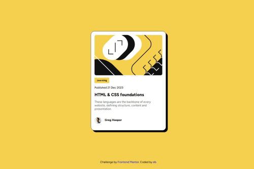
Proud to build the site with a good acuracy, but ill probabily learn and use flexbox in the next time. Every solution to my problems that i find in other peoples code is using flexbox, so of course this will take me to another coding level.
What challenges did you encounter, and how did you overcome them?Centralize the card on the center. I have a lot of difficult doing this and all the solutions that i found is using flexbox, that i dont know use. I overcome using margin auto and adding a margin on top to give a free space, like on the solution.
What specific areas of your project would you like help with?Make a responsive site.
Please log in to post a comment
Log in with GitHubCommunity feedback
- @Mdhenderson14
Hi there, nice preview card you've created!
I would like to mention, without comparing yours to the original, that the spacing between the words of your description isn't ideal from a user perspective. Because your text takes up about 80% of the card container, I assume the text is also in a container, which may not be necessary.
For my own description I used the following: font-size: 1 rem; text-align: left; color: var(--color2);
Without a container, all other styling for my publish date, title, and description came from the styling of the parent card container.
I hope this is helpful!
Join our Discord community
Join thousands of Frontend Mentor community members taking the challenges, sharing resources, helping each other, and chatting about all things front-end!
Join our Discord