


@Islandstone89
Posted
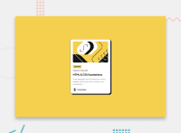
HTML:
-
Consider wrapping the date in a
<time>element:<p>Published <time datetime="2023-12-21">21 Dec 2023</time></p>. -
The profile image needs alt text, like "Headshot of Gary Hooper".
-
.attributionshould be a<footer>, and it needs to be moved outside of the<main>, as they are distinct semantic landmarks.
CSS:
-
Including a CSS Reset at the top is good practice.
-
Use the style guide to find the correct
font-family. -
Add around
1remofpaddingon thebody, so the card doesn't touch the edges on small screens. -
Remove the margin on the card.
-
To center the card horizontally and vertically, with some space between the main and the footer, use Flexbox on the body:
display: flex;
flex-direction: column;
justify-content: center;
align-items: center;
min-height: 100svh;
gap: 2rem;
-
Remove the width on "Learning" and on the card. Add
display: inline-blockon "Learning". -
Add a
max-widthof around20remon the card, to prevent it from getting too wide on larger screens. -
font-sizemust never be in px. This is a big accessibility issue, as it prevents the font size from scaling with the user's default setting in the browser. Use rem instead.
