Submitted 8 months agoA solution to the Blog preview card challenge
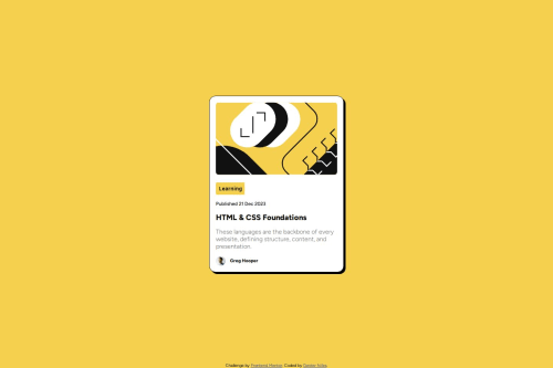
Blog Preview Card Main w/ HTML and CSS

P
@dexterniles
Solution retrospective
What are you most proud of, and what would you do differently next time?
I think i really flew through this one. Writing the HTML structure was very easy and the css was about the same. Overall I am very happy with the outcome.
What challenges did you encounter, and how did you overcome them?Nothing too bad. Didn't even have to turn to google for this one which is a major step.
What specific areas of your project would you like help with?Really just looking for ways to streamline the code. If there are easier and more compact ways to do things I would love to hear about it.
Code
Loading...
Please log in to post a comment
Log in with GitHubCommunity feedback
No feedback yet. Be the first to give feedback on Dexter Niles's solution.
Join our Discord community
Join thousands of Frontend Mentor community members taking the challenges, sharing resources, helping each other, and chatting about all things front-end!
Join our Discord