Skip to content
  • Unlock Pro
  • Log in with GitHub
Solution
Submitted about 1 year ago

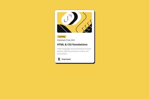
Blog Preview Card (React and Tailwind)

Justin Levy•100
@justinsane
A solution to the Blog preview card challenge
View live sitePreview (opens in new tab)View codeCode (opens in new tab)

Solution retrospective


What are you most proud of, and what would you do differently next time?

I'm most proud of coding this component fairly quickly.

What challenges did you encounter, and how did you overcome them?

I slowed down when attempting to style the 'Learning' heading with a background color. Originally I used an h3 element but realized I needed to use a span so the background color wouldn't stretch the entire width of the div. I learned the difference between block elements (most common) and inline elements (like span). The solution was to use inline-block Tailwind CSS.

What specific areas of your project would you like help with?

I could use more help translating the Figma design to css, specifically how to use 'rem' and the association with Tailwind classes.

Code
Select a file

Please log in to post a comment

Log in with GitHub

Community feedback

  • P
    Daniel 🛸•44,830
    @danielmrz-dev
    Posted about 1 year ago

    Hello there!

    Congrats on completing the challenge! ✅

    Your project is looking fantastic!

    I'd like to suggest a way to make it even better:

    • Using margin and/or padding isn't always the most effective method for centering an element.

    Here's a highly efficient approach to position an element at the center of the page both vertically and horizontally:

    📌 Apply this CSS to the body (avoid using position or margins in order to work correctly):

    body {
        min-height: 100vh;
        display: flex; 
        justify-content: center;
        align-items: center;
    }
    

    I hope you find this helpful!

    Keep up the excellent work!

    Marked as helpful
  • P
    Darkstar•1,440
    @DarkstarXDD
    Posted about 1 year ago

    Looks good, couple of things you could improve.

    • The "Learning" and the date are not headings. They are paragraphs. So you can use <p>. The <h1> is the only headings in this design.
    • You can directly add the inline-block to the <p> tag (currently you have this as an h2) that contains the "Learning". The <span> is redundant here.
    • To center the entire component on the screen you can use flex or grid. Giving a margin-top is not a proper way to achieve it. Since you are using tailwind it would be flex flex-col justify-center items-center min-h-screen on the root div. You can then remove the margin-top on your component. This way no matter what the screen height is the component will be in the center.

    You can convert the px font sizes in the Figma design to rem by dividing the px value by 16. So if the font-size in Figma is 14px, then the rem value would be 14/16 = 0.875. In Tailwind font-sizes are defined in rem so you only need to find the utility class that has the value you are looking for.

    Marked as helpful

Join our Discord community

Join thousands of Frontend Mentor community members taking the challenges, sharing resources, helping each other, and chatting about all things front-end!

Join our Discord

Stay up to datewith new challenges, featured solutions, selected articles, and our latest news

Frontend Mentor

  • Unlock Pro
  • Contact us
  • FAQs
  • Become a partner

Explore

  • Learning paths
  • Challenges
  • Solutions
  • Articles

Community

  • Discord
  • Guidelines

For companies

  • Hire developers
  • Train developers
© Frontend Mentor 2019 - 2025
  • Terms
  • Cookie Policy
  • Privacy Policy
  • License

Oops! 😬

You need to be logged in before you can do that.

Log in with GitHub

Oops! 😬

You need to be logged in before you can do that.

Log in with GitHub

How does the accessibility report work?

When a solution is submitted, we use axe-core to run an automated audit of your code.

This picks out common accessibility issues like not using semantic HTML and not having proper heading hierarchies, among others.

This automated audit is fairly surface level, so we encourage to you review the project and code in more detail with accessibility best practices in mind.

How does the CSS report work?

When a solution is submitted, we use stylelint to run an automated check on the CSS code.

We've added some of our own linting rules based on recommended best practices. These rules are prefixed with frontend-mentor/ which you'll see at the top of each issue in the report.

The report will audit all CSS, SCSS and Less files in your repository.

How does the HTML validation report work?

When a solution is submitted, we use html-validate to run an automated check on the HTML code.

The report picks out common HTML issues such as not using headings within section elements and incorrect nesting of elements, among others.

Note that the report can pick up “invalid” attributes, which some frameworks automatically add to the HTML. These attributes are crucial for how the frameworks function, although they’re technically not valid HTML. As such, some projects can show up with many HTML validation errors, which are benign and are a necessary part of the framework.

How does the JavaScript validation report work?

When a solution is submitted, we use eslint to run an automated check on the JavaScript code.

The report picks out common JavaScript issues such as not using semicolons and using var instead of let or const, among others.

The report will audit all JS and JSX files in your repository. We currently do not support Typescript or other frontend frameworks.

Oops! 😬

You need to be logged in before you can do that.

Log in with GitHub

Oops! 😬

You need to be logged in before you can do that.

Log in with GitHub