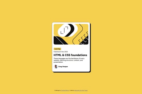
Blog preview card Responsive

Solution retrospective
What am I most proud of?
I’m proud of how I implemented responsive typography using modern CSS techniques like clamp() and rem, avoiding media queries altogether. I also effectively utilized variable fonts for better performance and flexibility, which improved the overall design consistency. Additionally, the smooth hover effects and polished card layout make the solution feel interactive and professional.
What would I do differently next time? Next time, I’d focus more on accessibility, such as ensuring better keyboard navigation and contrast ratios for improved usability. I’d also experiment with CSS custom properties (variables) to make styling more reusable and scalable, especially for colors and spacing. Finally, I might explore adding animations to further enhance user engagement.
What challenges did you encounter, and how did you overcome them?-
Ensuring Responsive Typography Without Media Queries It was challenging to make the font sizes adjust dynamically across screen sizes without relying on media queries. I overcame this by using the clamp() function in combination with rem, which allowed me to set a fluid font size range based on the viewport width.
-
Managing Variable Fonts Understanding how to implement variable fonts effectively took some trial and error, especially ensuring all weights and styles were accessible while maintaining performance. I resolved this by carefully configuring @font-face and testing the fonts across different elements.
-
Maintaining Clean Layout and Interactivity Balancing a clean design with interactive elements like hover and focus states was tricky, especially when fine-tuning shadows and transitions. I iterated several times, testing in the browser, and used transition properties for smooth effects that didn’t overwhelm the design.
These challenges pushed me to explore new CSS techniques and improved my problem-solving approach for responsive and accessible designs.
Please log in to post a comment
Log in with GitHubCommunity feedback
No feedback yet. Be the first to give feedback on Alessandro De Pietri Tonelli's solution.
Join our Discord community
Join thousands of Frontend Mentor community members taking the challenges, sharing resources, helping each other, and chatting about all things front-end!
Join our Discord