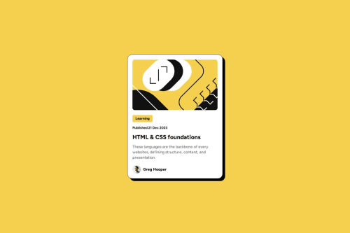
Blog Preview Card Responsive and Active State

Please log in to post a comment
Log in with GitHubCommunity feedback
- @Barnabas001
I love your work, most importantly the idea of that hover effect brilliant design i must confess
Marked as helpful - P@Islandstone89
HTML:
-
I would wrap the date in the
<time>element:<p class="published-date">Published <time datetime="2023-12-21">21 Dec 2023</time></p>. -
As this is a blog card, the heading requires a link within it.
-
"Greg Hooper" is not a heading, but a
<p>.
CSS:
-
Including a CSS Reset at the top is good practice.
-
Move
font-family: "Figtree", sans-serifandcolor: #121212from*tobody. -
I recommend adding a bit of
padding, for example16px, on thebody, to ensure the card doesn't touch the edges on small screens. -
Descendant selectors like
.card .published-dateincrease specificity, making the styles harder to override. Instead, usepublished-dateas the selector. -
Move the styles on
.containerto thebody. Removewidth: 100%, as block elements are 100% wide by default. -
Except for the author image, remove all widths in
px. -
Add a
max-widthof around20remon the card to prevent it from getting too wide on larger screens. -
font-sizemust never be in px. This is a significant accessibility issue, as it prevents the font size from scaling with the user's default browser setting. Use rem instead. -
line-heightmust also never be inpx. -
On
.author, you can removeflex-direction: rowandjustify-content: flex-start,as these are default values. -
Remove
margin-left: 10pxon "Greg Hooper". Instead, setgap: 10pxon the Flex container,.author. -
On the top image, add
display: block,height: autoandmax-width: 100%- the max-width prevents it from overflowing its container. Without this, an image would overflow if its intrinsic size is wider than the container.max-width: 100%makes the image shrink to fit inside its container. -
Media queries must be in
remorem, notpx. We usually style for mobile first, then usemin-widthmedia queries for larger screens. Instead of using media queries to changefont-size, you can use theclamp()function.
-


Join our Discord community
Join thousands of Frontend Mentor community members taking the challenges, sharing resources, helping each other, and chatting about all things front-end!
Join our Discord