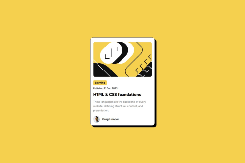
Blog Preview Card simple solution

Solution retrospective
I am happy that I got more comfortable with CSS and finding the correct solutions to position each element correctly, almost on the first try.
What challenges did you encounter, and how did you overcome them?As usual the media queries are still a bit of mystery to me, but the more I practice the better I understand.
Please log in to post a comment
Log in with GitHubCommunity feedback
- P@Sven-27
Hi,
First of all it looks good wath you did. Couple suggestions i have.
IN your html you use mainly div. Try to use semantic elements as much as possible. Div is used when no other element is suited. Like <div class="footer"> You can do <footer> instead.So it is a good thing to learn more about them. Otherwise it looks good.
CSS: I see that you have imported the fonts directly. Since they are already in de asset folder it proberly was the meaning to use them instead of importing.Look at 'font face' to use local fonts in your project. The use of variables is perfect.
You didn't make the fonts responsive. Try to google how to make the fonts responsive without media query. That was part of the assignment. Try to structure your CSS the same as your html. I will give you my github link so you can see what i mean.
Take a look at your hover on the h2. It does not turn yellow.
Hope you can use this feedback and if you have questions you can always ask me either here or on discord.
My github is https://github.com/Sven-27/blog-preview-card
Regards Sven
Marked as helpful

Join our Discord community
Join thousands of Frontend Mentor community members taking the challenges, sharing resources, helping each other, and chatting about all things front-end!
Join our Discord