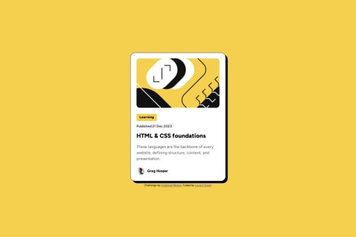
Blog preview card solution using Flexbox

Solution retrospective
I'm most proud of achieving a pixel-perfect match with the design, especially the hover effects and responsive layout. The card's shadow effect and the smooth transition on the title hover came out particularly well. The mobile responsiveness works smoothly, and the image handling in different screen sizes is effective.
For next time, I would:
- Start with a mobile-first approach rather than desktop-first
- Use CSS custom properties (variables) for colors and spacing to make the code more maintainable
- Consider using relative units (rem/em) more consistently throughout the project
- Plan the responsive breakpoints more systematically
The main challenges I faced were:
-
Image handling in the mobile view - Initially, the image wasn't scaling properly on mobile screens. I solved this by using object-fit: cover and setting specific dimensions for the image container.
-
Font sizing for different screens - I struggled with making the font sizes match the design exactly on both mobile and desktop. While I ended up using media queries, I learned there are alternative approaches using relative units.
-
Card shadow and border - Getting the exact look of the card's shadow and border took some trial and error. I eventually achieved it by combining border and box-shadow properties effectively.
I overcame these challenges by consulting MDN documentation and experimenting with different CSS properties until I found the right combination.
What specific areas of your project would you like help with?I would appreciate feedback on:
-
Best practices for responsive typography - I'd like to know if there are better ways to handle font-size changes between mobile and desktop views without relying heavily on media queries.
-
CSS organization - While my code works, I'd love to hear suggestions about making it more maintainable and following industry best practices.
Please log in to post a comment
Log in with GitHubCommunity feedback
- @KapteynUniverse
Merhaba Levent, nice job.
For better responsive typography, you can use clamp function, there are also clamp calculators.
Addition to that:
Landmarks, (or this page) are essencial for accesibility. Every page needs one main. Changing your container div with a main would be good. Also attribution div should be in a footer.
Avoid using fixed values like
width: 384px;, for better responsiveness use max-width with rem;max-width: 24rem;Images needs a meaningful alt text, unless decorative. For this case, i think illustration image is decorative, so you can leave alt text empty or use aria-hidden and also Greg's avatar image needs a bit more content.
That active state in the design (your h3) means that tag is interactible, for this case it should be a hyperlink of the article. Like:
<h3>
 <a href="#">HTML & CSS foundations</a>
</h3>
Also if you used h3 for the size, don't. Do not skip heading levels: always start from h1, followed by h2 and so on. But another thing; this card would never be used to serve the main heading on a page, so on a real page h2 or h3 probably would be ok.
You can put font-family etc. to the body, no need to use with *. Most of the elements inherit them. For those that don't and for many other things: i recommend you to use a modern css reset for every project. You can check Andy Bells reset too.
Marked as helpful

Join our Discord community
Join thousands of Frontend Mentor community members taking the challenges, sharing resources, helping each other, and chatting about all things front-end!
Join our Discord