Submitted about 1 month agoA solution to the Blog preview card challenge
Blog preview card solution using semantic HTML and CSS-flexbox

@incmoga
Solution retrospective
What are you most proud of, and what would you do differently next time?
This project challenged me in several interesting ways:
1. Image adaptation challenges:
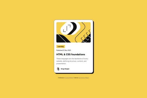
/* Wrapping img in a container */
<div class="card__image-container">
        <img
          src="assets/images/illustration-article.svg"
          alt="Abstract illustration showing web development"
          class="card__image"
        >
</div>
/* Solution for image cropping */
.card__image-container {
    position: relative;
    border-radius: 10px;
    overflow: hidden;
}
The main difficulty was adapting the image for the mobile version - it wasn't supposed to change proportions but required cropping on both sides. This misled me at first, and I didn't immediately understand why the dimensions didn't match the layout.
2. Border-box peculiarity:
/* Accounting for border in the element's total width */
.card {
  padding: 23px; /* 23px + 1px border = 24px */
  border: 1px solid var(--color-gray-900);
}
I discovered an interesting feature: when an element has both a border and padding, their values are added together, affecting the internal dimensions of the element. This required adjusting the padding.
Code
Please log in to post a comment
Log in with GitHubCommunity feedback
- P@vvarthan7
Nice work

Join our Discord community
Join thousands of Frontend Mentor community members taking the challenges, sharing resources, helping each other, and chatting about all things front-end!
Join our Discord