
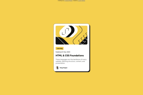
Solution retrospective
I am pleased with the structure of my HTML, by adding classes to elements this makes the CSS file as readable as possible and to make the content easier to design. I made sure to list the elements/classes in my CSS files following the structure of the HTML.
What challenges did you encounter, and how did you overcome them?I struggled a bit with choosing the appropriate units for each element to ensure responsiveness. Also when adjusting for media queries I had to go back into my style.css and adjust some of the units I had been using as this affected the layout.
What specific areas of your project would you like help with?Would it be better to make the size of smaller elements like the 'tag' in this project as a fixed size e.g. 50px than set it as a relative %? Have I used @media in the correct way? I had to set max-width for mobile to 376px.
Please log in to post a comment
Log in with GitHubCommunity feedback
No feedback yet. Be the first to give feedback on Lauren Delmar's solution.
Join our Discord community
Join thousands of Frontend Mentor community members taking the challenges, sharing resources, helping each other, and chatting about all things front-end!
Join our Discord