blog-preview-card

Please log in to post a comment
Log in with GitHubCommunity feedback
- P@skhbabez
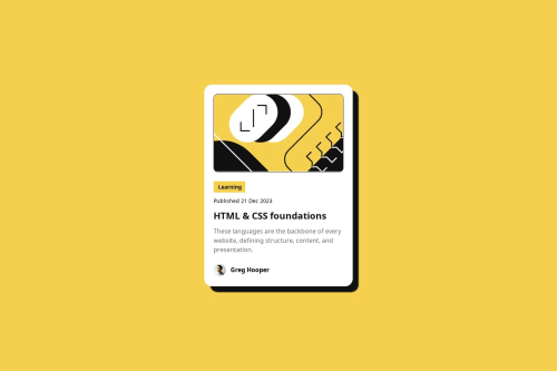
Great job, this is already really close to the intended design and looks good overall. You already seem to have good CSS and HTML fundamentals, so I won't go over the basics here. I don’t think it’s really necessary to fully copy the Figma file in detail, so I won't correct slight differences. If you want to have your design perfectly match, you can inspect the elements in the Figma file further to get the accurate values, like for the box shadow or the borders.
A Few Improvement Ideas
Responsive Design
First of all, you seemed to have overlooked the mobile design, which requires different font sizes and widths. If you test your design in the browser (open dev tools and test it on different screens there), you’ll see it doesn’t look good on mobile—stretching outside of the screen and with font sizes not adjusting to smaller sizes.
Maybe look into this course for responsive design especially media queries:
Responsive Design - web.devFor this section, using the
clamp()function might also be enough:
CSS clamp() - MDNhtml { font-size: 62.5%; } body { font-size: 1.6rem; } .category h2 { font-size: clamp(1.2rem, 2vw, 1.4rem); color: #111111; font-weight: bold; }Font Family
The font family for this was supposed to be Figtree, which is provided through the asset folder in the template. You can import it using @font-face like this.:
@font-face {
  font-family: "Figtree";
  src: url("assets/fonts/Figtree-VariableFont_wght.ttf");
  font-weight: 500 800;
  font-style: normal;
}

*,
*::before,
*::after {
  font-family: "Figtree", sans-serif;
}
Semantic HTML
Your structure mostly follows the Figma file’s layout, which is fine, but it does not follow semantic HTML practices for accessibility. For example, wrap your main content with a <main> tag or use <article> for individual cards.
Hover State for Heading
You missed adding the hover states for the main heading. I think it was intended to be a link that changes color to yellow on hover.
If you make it a link (<a>), you don’t need to manually set cursor: pointer. Otherwise, if you keep it as a heading, here’s how you can add a hover effect and change the cursor as well:
.content h1:hover {
  color: #f4d04e;
  cursor: pointer;
}
CSS Variables
For future projects, consider setting up CSS variables and using var(). While not strictly necessary for small projects, it greatly improves readability and reusability when working with e.g. color values.
:root {
  --yellow: #f4d04e;
}

body {
  background-color: var(--yellow);
}
Child Selector
>This is just something I noticed, but you use the direct child descendant selector
>a lot. I mostly see people use a space to just select any descendant, no matter the nesting level, like I did in my examples. There is nothing wrong with doing it the way you did, but it's also mostly not necessary. This might actually break your designs sometimes when you add additional nesting levels through divs. - @zZz-ren
You can make it more identical giving the card 1px black border instead of the svg object
Join our Discord community
Join thousands of Frontend Mentor community members taking the challenges, sharing resources, helping each other, and chatting about all things front-end!
Join our Discord