Skip to content
  • Unlock Pro
  • Log in with GitHub
Solution
Submitted 12 months ago

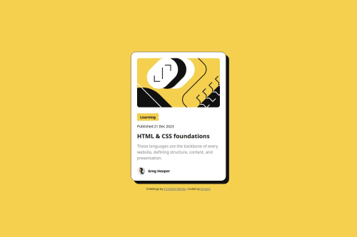
Blog Preview Card using BEM

bem
Eugene Vuong•40
@EugeneVuong
A solution to the Blog preview card challenge
View live sitePreview (opens in new tab)View codeCode (opens in new tab)

Solution retrospective


What are you most proud of, and what would you do differently next time?

I am very proud of using "fit-content" on the width. I did not know about this and it made the status "Learning" easy to implement. One thing I would do differently is the image from the mobile layout. In the image of the mobile layout, some of the image was cut. I am completely unaware on how to do this.

What challenges did you encounter, and how did you overcome them?

One challenge I encountered was differentiating between px, rem, and em. Ultimately, I decided only to use rem and px (only for the blog border).

What specific areas of your project would you like help with?
  1. Is my usage of px, rem, and em correct? I have only used rem and px throughout my code because I couldn't find a suitable place for em. If you have any suggestions on where I can use each of these units better, I would love to know.

  2. Part of the mobile image is cut out. making the image look bigger than it actually is. How do I replicate/implement this on my website? Currently, I only use width: 100%;

  3. Is my responsiveness good and is everything up to scale depending on the font size and zoom of the browser? Any areas of improvement?

Code
Loading...

Please log in to post a comment

Log in with GitHub

Community feedback

No feedback yet. Be the first to give feedback on Eugene Vuong's solution.

Join our Discord community

Join thousands of Frontend Mentor community members taking the challenges, sharing resources, helping each other, and chatting about all things front-end!

Join our Discord
Frontend Mentor logo

Stay up to datewith new challenges, featured solutions, selected articles, and our latest news

Frontend Mentor

  • Unlock Pro
  • Contact us
  • FAQs
  • Become a partner

Explore

  • Learning paths
  • Challenges
  • Solutions
  • Articles

Community

  • Discord
  • Guidelines

For companies

  • Hire developers
  • Train developers
© Frontend Mentor 2019 - 2025
  • Terms
  • Cookie Policy
  • Privacy Policy
  • License

Oops! 😬

You need to be logged in before you can do that.

Log in with GitHub

Oops! 😬

You need to be logged in before you can do that.

Log in with GitHub

How does the accessibility report work?

When a solution is submitted, we use axe-core to run an automated audit of your code.

This picks out common accessibility issues like not using semantic HTML and not having proper heading hierarchies, among others.

This automated audit is fairly surface level, so we encourage to you review the project and code in more detail with accessibility best practices in mind.

How does the CSS report work?

When a solution is submitted, we use stylelint to run an automated check on the CSS code.

We've added some of our own linting rules based on recommended best practices. These rules are prefixed with frontend-mentor/ which you'll see at the top of each issue in the report.

The report will audit 1st-party linked stylesheets, and styles within <style> tags.

How does the HTML validation report work?

When a solution is submitted, we use html-validate to run an automated check on the HTML code.

The report picks out common HTML issues such as not using headings within section elements and incorrect nesting of elements, among others.

Note that the report can pick up “invalid” attributes, which some frameworks automatically add to the HTML. These attributes are crucial for how the frameworks function, although they’re technically not valid HTML. As such, some projects can show up with many HTML validation errors, which are benign and are a necessary part of the framework.