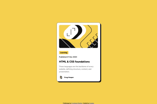
Submitted over 1 year agoA solution to the Blog preview card challenge
Blog preview card using clamped font

@Esosek
Solution retrospective
Hi, would like to get your opinion on font-sizes.
- I prefer using rem for font-size so it scales nice with users setting in the browser. Is it a good practice to scale fonts according to vw size and clamp it to rem?
- How can I easily apply a base text size? Will the code below scale every child font-size?
body {
font-size: 0.8rem;
}

@media (min-width: 40rem) {
body {
font-size: 1rem;
}
}

.child {
font-size: 1rem;
}
Thanks! Aleš
Code
Loading...
Please log in to post a comment
Log in with GitHubCommunity feedback
No feedback yet. Be the first to give feedback on Aleš Zima's solution.
Join our Discord community
Join thousands of Frontend Mentor community members taking the challenges, sharing resources, helping each other, and chatting about all things front-end!
Join our Discord