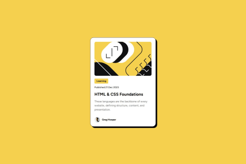
Blog preview card using CSS Flexbox and clamp

Solution retrospective
I think it looks pretty dang close to the design. I could polish it further by adjusting the font clamp values to handle the in-between resolutions.
What challenges did you encounter, and how did you overcome them?The hint about reducing font size without using media queries led me to learn about clamp, pretty cool stuff
What specific areas of your project would you like help with?Looking for feedback on the fundamentals HTML/CSS, anything I can do differently to improve readability or structure?
Please log in to post a comment
Log in with GitHubCommunity feedback
- @thisisharsh7
Great job on the blog card! Your design is very close to the target, and using
clampfor responsive font sizes is a smart move—nice work learning it!For better HTML/CSS:
- HTML Structure: Move inline
<style>to a separatestyle.cssfile for maintainability. Use semantic tags like<article>instead of<div class="card">for better accessibility. - CSS Readability: Group related styles (e.g., all
.cardproperties) and use comments to separate sections (e.g.,/* Card Styles */). Replacepxwithremfor margins/paddings (e.g.,padding: 1.5rem) to scale with root font size, improving responsiveness. - Accessibility: Add
role="img"to the avatar image for screen readers. - Update
.authorSection:
<div class="author text-preset-3-bold"> <img src="assets/images/image-avatar.webp" alt="Greg Hooper's avatar" class="avatar" role="img"> <span class="author-name">Greg Hooper</span> </div>- Update body styling: Use
min-heightalways instead ofheightit will keep content from cropping.
Keep up the awesome work!
Marked as helpful - HTML Structure: Move inline
- @MarziaJalili
Hats off to your solution! 🎉🥳
🌟 Some tiny tips?
✅ First, consider changing <div class="card"> to <main class="card"> as every web page needs one <main> element to represent the main its content.
✅ Second, using grid is the cleanest way for centering:
display: grid;
place-items: center;
✅ Also, you don’t need to wrap the image inside a <div> element, man. Simply move the class name to the <img> element itself.
✅ Lastly, change <div class="text-preset-2> to <p class="text-preset-2 > to represent a paragraph.
Stay consistent and everything will be a cake walk!
😎😎😎
Marked as helpful


Join our Discord community
Join thousands of Frontend Mentor community members taking the challenges, sharing resources, helping each other, and chatting about all things front-end!
Join our Discord