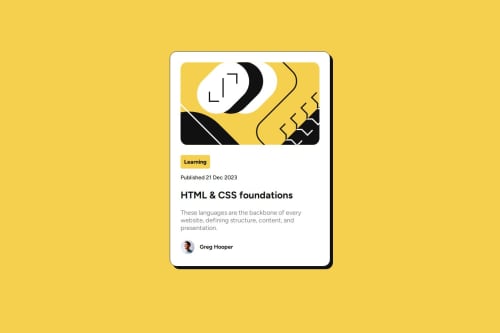
Blog Preview Card using flexbox

Solution retrospective
I'm most proud of how it ended up looking in desktop, I would try and intregrate more media queries so I can make it more responsive to mobile devices
What challenges did you encounter, and how did you overcome them?I found difficult to center the container of all the card content to the center of the page, I contained everything into a section element, then I gave it height. Then I styled it using CSS, adding a flexbox to align it horizontally and vertically.
What specific areas of your project would you like help with?I'm still finding another to put the container in the center of the page, if you have another way, plase share it.
Also, what is the best practice to make a responsive design, to make it look good on mobile
Please log in to post a comment
Log in with GitHubCommunity feedback
- @Si1entERA
Hello @joacomenda.
Congratulations on the completion of your project.
I'm still new and I'm not at the level of the other developer here but I'll pass on some advice I recently received from @danielmrz-dev.
"Try using<h1> to <h6> tags for headings instead of<p> since they are used for paragraphs. When it comes to headings. This can improve the structure of your HTML and make it look cleaner."
This is one of my mistakes I've made a lot and I hope you find this helpful. Happy coding.
Marked as helpful - @BluffSet7340
Your method of using the section and styling it accordingly works just as well. But if you want another way, you could try and place the image, the body, and the avatar and author name into 3 separate div elemtents and then add the CSS properties on the body element. That will target all the div elements inside of the body and center the content horizontally and vertically.
For responsive design, it depends. Some people like to start with a mobile first workflow, where they design the webpage for mobile devices first and then use media queries to adjust for desktop sizes. What I did was design it for desktop first and then reduced the width accordingly when the screen width was reduced to that of mobile devices
- @fhelix09
Thanks for this I learn new by viewing your script.


Join our Discord community
Join thousands of Frontend Mentor community members taking the challenges, sharing resources, helping each other, and chatting about all things front-end!
Join our Discord