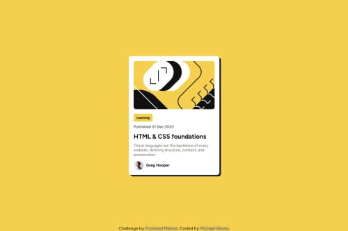
Blog preview card using Flexbox

Solution retrospective
I’m most proud of how I kept the design clean and simple, focusing on making the layout responsive using Flexbox. The challenge was straightforward, but I made sure that the card was fully responsive across all screen sizes.
Next time, I would implement hover effects or animations to make the card more interactive. I’d also consider improving the accessibility of the page by adding ARIA roles and attributes to enhance screen reader compatibility.
What challenges did you encounter, and how did you overcome them?The biggest challenge was making sure the layout adapted well on mobile screens. Since I was using Flexbox for the layout, I had to fine-tune the card's responsiveness to make sure the card and text stayed properly aligned.
I overcame this by utilizing CSS media queries and adjusting the width and layout properties to ensure a smooth, responsive design on all devices.
What specific areas of your project would you like help with?I would like feedback on the overall structure of the HTML and whether I could improve the semantic elements used. Any suggestions on optimizing the CSS or making the code cleaner would be much appreciated as well. Also, if anyone has tips on adding subtle animations to make the card more engaging, I’d love to hear those.
Please log in to post a comment
Log in with GitHubCommunity feedback
No feedback yet. Be the first to give feedback on Michael Okorie's solution.
Join our Discord community
Join thousands of Frontend Mentor community members taking the challenges, sharing resources, helping each other, and chatting about all things front-end!
Join our Discord