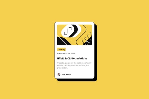
Submitted over 1 year agoA solution to the Blog preview card challenge
Blog preview card using Flexbox & Grid

@viveknagesh21
Solution retrospective
What are you most proud of, and what would you do differently next time?
I tried using CSS Grid for centering this time, as for first I used Flexbox. Centering blog card was a breeze!
I used line-height property, @font-face and even used font-weight.
What challenges did you encounter, and how did you overcome them?- Small but, I found :hover changing when it wasn't over the text, so I used
    .blog-card h2 {
        width: fit-content;
      }
2 . Responsiveness for Smaller Screen. I tried using fixed units with calc(), but it worked with relative layout (vw).
What specific areas of your project would you like help with?Any alternative for responsive design
@media screen and (max-width: 768px) {
        .blog-card {
          width: 42vw;
        }
      }
As I had to try different values for this.
Code
Loading...
Please log in to post a comment
Log in with GitHubCommunity feedback
No feedback yet. Be the first to give feedback on viveknagesh21's solution.
Join our Discord community
Join thousands of Frontend Mentor community members taking the challenges, sharing resources, helping each other, and chatting about all things front-end!
Join our Discord