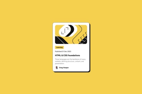
Blog Preview Card using Flexbox

Solution retrospective
I'm most proud of how closely I was able to match the original design using only HTML and CSS. The layout is clean, responsive, and visually appealing, with consistent spacing, typography, and color usage. I also enjoyed implementing the hover effect on the blog title — a small touch that adds interactivity and polish to the UI.
Next time, I would:
Add accessibility improvements, such as aria-labels and better alt text for screen readers.
Refactor the layout using CSS Grid for even more control over spacing and alignment.
Possibly integrate utility-first CSS (like Tailwind) to speed up development.
Use a component-based structure if the project were larger, to prepare for scalability.
What challenges did you encounter, and how did you overcome them?I found it challenging to match the exact spacing and alignment of the design, especially with padding and gaps. Ensuring the card remained responsive on smaller screens also took some tweaking. I overcame these by using Flexbox for layout control and media queries to adjust styles for different screen sizes.
What specific areas of your project would you like help with?I’d appreciate feedback on improving accessibility, such as adding proper ARIA roles and keyboard navigation. Additionally, I’d like advice on organizing CSS for better scalability and how to use CSS Grid to create more flexible layouts.
Please log in to post a comment
Log in with GitHubCommunity feedback
- P@MoonBeam-Studio
As you said the layout is really clean and responsive, although I miss a little bit of transitions between hover and normal, since the color change can be a bit abrupt

Join our Discord community
Join thousands of Frontend Mentor community members taking the challenges, sharing resources, helping each other, and chatting about all things front-end!
Join our Discord