


@Islandstone89
Posted
HTML:
-
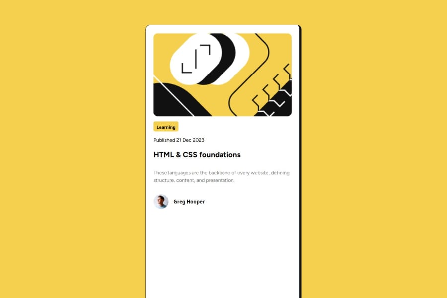
Every webpage needs a
<main>that wraps all of the content, except for<header>andfooter>. This is vital for accessibility, as it helps screen readers identify a page's "main" section. Wrap the card in a<main>, and change.mainto.card. -
Replace the
idwith aclass. -
"Learning" is a
<p>. -
Wrap the date in a
<time>element:<p>Published <time datetime="2023-12-21">21 Dec 2023</time></p>. -
The heading would have a link as this is a blog card.
-
An appropriate alt text for the profile image would be "Headshot of Gary Hooper".
-
"Gary Hooper" is a
<p>.
CSS:
-
Including a CSS Reset at the top is good practice.
-
Add around
1remofpaddingon thebody, so the card doesn't touch the edges on small screens. -
Remove the margin on the card.
-
To center the card horizontally and vertically, use Flexbox on the body:
display: flex;
flex-direction: column;
justify-content: center;
align-items: center;
min-height: 100svh;
-
Except for the profile image, remove all widths and heights.
-
Add a
max-widthof around20remon the card, to prevent it from getting too wide on larger screens. -
Remove
font-style: normal, as that is the default value already. -
Add
display: inline-blockorwidth: fit-contenton "Learning". -
font-sizemust never be in px. This is a big accessibility issue, as it prevents the font size from scaling with the user's default setting in the browser. Use rem instead. -
Paragraphs have a default value of
font-weight: 400, so there is no need to declare it. -
It is standard practice to add
display: blockandmax-width: 100%on images - the max-width makes images resize according to their container. -
As the design doesn't change, there is no need for any media queries. When you do need them, they should be in rem, not px. Also, it is common practice to do mobile styles first and use media queries for larger screens.
