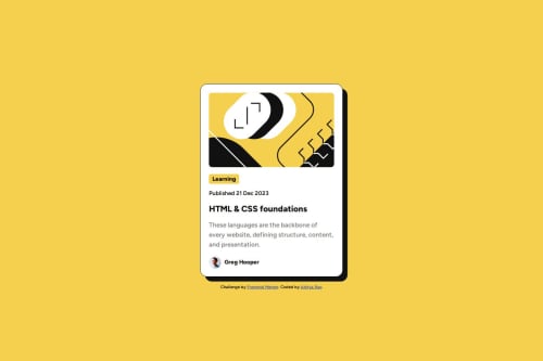
Blog Preview Card using HTML & CSS

Solution retrospective
I learned from my last challenge and started using flexbox and a css reset. Fortunately, I did not spend a lot of time adjusting, the spacing between elements, to get it just right.
I will refine my process for upcoming challenges.
What challenges did you encounter, and how did you overcome them?I wanted a better system to make fonts responsive. I knew about clamp() and fluid typography through a online tool called utopia, which I tried using in this challenge.
I'm not sure if I'm using @font-face correctly. I'm sure there is more to fonts than I know, so learning about different ways to use fonts (web or local) would be helpful.
Another one is making use of fluid type scale in the project.
Please log in to post a comment
Log in with GitHubCommunity feedback
- @AutumnsCode
Since I am not really good in clamp(). However, you could use :root and declare the font-sizes there. and then use underneath a mediaquery afterward.
:root { /* Padding and font-sizes */ --size-1: 0.25rem; --size-2: 0.5rem; --size-3: 0.75rem; --size-4: 0.75rem; --size-5: 0.875rem; --size-6: 0.875rem; --size-7: 1.25rem; --size-8: 1.25rem; --size-9: 1.5rem; } @media (width >= 25rem) { :root { --size-2: 1rem; --size-4: 0.875rem; --size-6: 1rem; --size-8: 1.5rem }``` ``@font-face`` looked good. Just you don't need two src :) Well doneMarked as helpful
Join our Discord community
Join thousands of Frontend Mentor community members taking the challenges, sharing resources, helping each other, and chatting about all things front-end!
Join our Discord