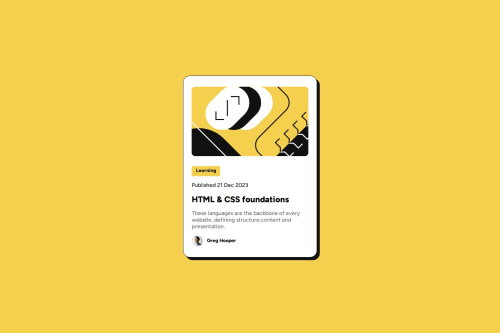
Submitted 12 months agoA solution to the Blog preview card challenge
Blog Preview Card using html and css

@RitikaV29
Code
Please log in to post a comment
Log in with GitHubCommunity feedback
- @helenhapp
Hi!
Congrats on completing this challenge.
Overall, your solution looks great. But if you open it with developer tools (Ctrl + Shift + I on Windows) and try how it looks on different devices, you can see that the card might be a bit too wide on some mobile devices. However, the width you set looks great on a wide screen. To set different widths for different screen sizes you can use the CSS @media rule, which might look like this (as an example):
.container {
    max-width: 360px;
    ...
}

@media (min-width: 400px) {
    .container {
        max-width: 384px;
    }
}
I also suggest you use max-width instead of width to make the content more responsive.
I hope this is helpful. Happy coding!
Marked as helpful

Join our Discord community
Join thousands of Frontend Mentor community members taking the challenges, sharing resources, helping each other, and chatting about all things front-end!
Join our Discord