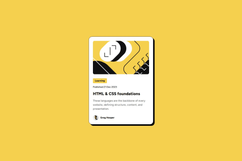
Blog Preview Card Using Semantic HTML and Responsive CSS

Solution retrospective
I'm most proud of how I managed to implement a fully responsive and accessible blog preview card that aligns closely with the provided design specifications. I used semantic HTML to enhance the content's meaning and search engine optimization, and I focused heavily on accessibility to ensure the website is usable by people with disabilities.
If I were to do this project again, I might explore using a CSS framework like Tailwind CSS to speed up the styling process and ensure consistency. Additionally, I'd consider integrating a light JavaScript functionality for dynamic interactions like expanding text or modal pop-ups to enhance user engagement.
What challenges did you encounter, and how did you overcome them?One of the main challenges was ensuring the design was fully responsive across different devices. I overcame this by using flexible CSS units, CSS variables, and media queries to adjust the layout elements dynamically based on the screen size. Another challenge was maintaining high accessibility standards. To overcome this, I ensured that all interactive elements were keyboard navigable and had appropriate ARIA labels and roles.
Implementing the focus and hover states to be distinct and informative without being disruptive required several iterations and testing.
What specific areas of your project would you like help with?I would appreciate feedback on what libraries/frameworks/tools I could use to make this process faster and more in line with industry standards. Also, any feedback on accessibility best practices would be great.
Please log in to post a comment
Log in with GitHubCommunity feedback
No feedback yet. Be the first to give feedback on Coco's solution.
Join our Discord community
Join thousands of Frontend Mentor community members taking the challenges, sharing resources, helping each other, and chatting about all things front-end!
Join our Discord