
Solution retrospective
I felt more comfortable with this challenge using flexbox. Flexbox has been something that has been difficult for me to work with. I also found working with the hover to be easy. The highlight behind the topic title took some time, but I got it.
What challenges did you encounter, and how did you overcome them?I'm still not getting the hang of margins. Every time I think I know how they will work, my content does not display as expected. What helps is for me to play around with them using percentages and static values.
What specific areas of your project would you like help with?Thank you for previewing my attempt at this challenge. I welcome your feedback.
I had problems trying to center the container on the page. I tried including align-items in .card to center the container horizontally and vertically, but it only centered the text and not the container. Not sure how to fix this so I used the margins with percentages.
Also, had trouble increasing the height of the card. If I increase the height, all of the child items in the container shift down and leave a space at the top.
Lastly, if there is any feedback that could help me with isolating/sizing the card image so that it stays in place and does not shift when I'm working with the headings and paragraph.
Please log in to post a comment
Log in with GitHubCommunity feedback
- @santiagodev10
Hi Melanie, I think your project is good, but there are some things I noticed that you can improve, which will help you in your next projects:
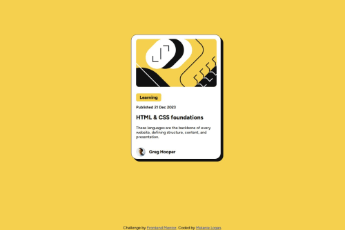
- The first thing is that the <main> tag is used as a semantic tag, meaning that the main content of the page goes inside it. Therefore, we should use it as the container for the main elements of our page. You are currently using it as the card itself. A better approach would be to add a <section> or <div> tag inside <main>, and that would be the card, like this:
<main>
  <section class= "card">
    All the inside elements of the card
  </section>
</main>
Besides doing it this way being more accurate semantically, you can have better control over the card.
-
The second thing is that you tried to center the container by adding align-items directly in the card, but that will not center the card. It will only center the children of the card, i.e., the elements inside it. To center the card in the document, you need to apply flexbox to the card's parent. In your case, the parent of the card is the <body> tag (that's why I mentioned before how to set the tags hierarchy to do these kinds of things easily). So basically, you need to know that the parent elements can control the position and distribution of their child elements, especially with flexbox and grid.
-
Third, if you want the card to be responsive and expand and adapt itself as the width of the screen gets larger, you can use width: 100% and max-width: 375px. That way, the card will expand until it reaches 375px and then stop.
-
Lastly, media queries are great and very helpful for making responsive designs. However, as you get better and better at CSS, you'll learn that there are many cases where you don't really need them to make something responsive, for example always use relative measures like % if you want an element to adapt with his container, this is important especially with the images, but if you need that the element stays at the same size no matter the size of the screen, then use absolute measures like px.
I will fork your project and make some of the changes I mentioned. I’ll send you a pull request to see if you like them 😉. Keep learning and practicing!
Marked as helpful - @BKFOE
Hi there!
Overall I think the Semantic HTML Usage, Alt attributes, clear class names, and the well-organized structure of your code are positives.
Some improvements I would suggest would be the alt attribute for the "hero-image" (alt="Yellow graphic background") could better describe the purpose of the image. For example, if it’s decorative, it could be left empty (alt="") or describe its role in relation to the article. Additionally, add ARIA roles or labels where necessary, e.g., for the avatar section to clarify its purpose to screen readers.
Another thing to keep in mind is consistent heading levels. Using <h3> for the topic and <h2> for the article title is good, but consider whether the hierarchy of headings accurately reflects the content.
Consider Wrapping the Avatar Section using a <figure> and <figcaption> for the avatar image and name to improve semantics.
This is a solid foundation, with minor improvements, the code will be even better in terms of accessibility, readability, and maintainability. Great effort! Keep refining your code as you work on more projects to build on this strong start.
Marked as helpful


Join our Discord community
Join thousands of Frontend Mentor community members taking the challenges, sharing resources, helping each other, and chatting about all things front-end!
Join our Discord