
Solution retrospective
Any feedback or suggestions regarding with my coding is highly appreciated. Thank you! :)
Please log in to post a comment
Log in with GitHubCommunity feedback
- @noelhoppe
Hi, here are some suggestions:
- As you know, it's good practice to separate structure (HTML) from design (CSS). That's why you can "link" your font-family with @import statement in css:
@import url('https://fonts.googleapis.com/css2?family=Figtree:wght@500;600;800&display=swap');
-
Remove line-height: 20px from the <footer>, it's overridden all the time. As you have don instead, it's good practice to use rem for line-height all the time.
-
Maybe you can define the colors in the :root element with css variables and than acces later on. That allows you to make comfortable changes.
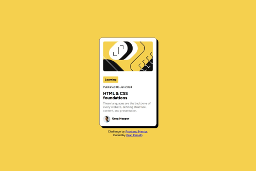
- <h3>Learning</h3> has to be a <p>-tag,
<span>Published 06 Jan 2024</span> has to be also a <p>-tag
-
Remove the <a> tag in line 34 and the <div> tag in line 35
-
In general, you use some unnecessary <div> containers, maybe it's a good practice to try to remove some <div> in your body{}. Tipp: I have used only one <div> in body.
-
Add in your css to body { min.-height: 100vh; display: flex; flex-direction:column;
But all in all: Good job, enjoy coding! justify-content: center; } to center your card.
Marked as helpful - P@danielmrz-dev
Hello @rame0033!
Your project looks great!
I noticed that you used
marginto place the card in the middle of the page. Here's a very efficient way to center the card:- You can apply this to the body (in order to work properly, you can't use position or margins):
body {
    min-height: 100vh;
    display: flex;
    justify-content: center;
    align-items: center;
}
I hope it helps!
Other than that, great job!
Marked as helpful - @Blackpachamame
Rame looks great on you!
I can only make the following comments as extra information:
- Apply display: block to the image to remove that annoying white space
- To center the content in the center of the screen, you can do it using
gridorflex, an example of what it would look like:
body { padding: 10px; min-height: 100vh; display: grid; place-content: center; gap: 20px; } main { max-width: 300px; /* margin: 6vh auto 3vh; You don't need this anymore */ background-color: hsl(0, 0%, 100%); display: flex; padding: 10px; border: 1px solid black; border-radius: 15px; box-shadow: 10px 10px black; }Marked as helpful - @MaximilianoDanielGarcia
Hi @rame0033, great job!
It looks really nice. If you want to centered just add this:
body {
    display: grid;
    place-items: center;
    min-height: 100vh;
}
Then, for the attribution you can do this:
footer {
    position: absolute;
    bottom: 25px;
}
After you apply these It will look better.
Marked as helpful


Join our Discord community
Join thousands of Frontend Mentor community members taking the challenges, sharing resources, helping each other, and chatting about all things front-end!
Join our Discord