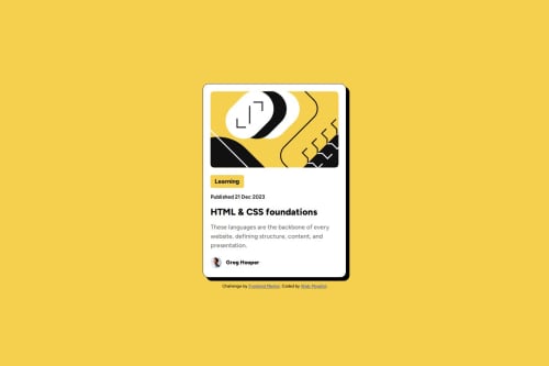
Blog preview card

Solution retrospective
-
Responsive Design: I’m proud of how the blog preview card adjusts smoothly across various screen sizes. The use of CSS Flexbox and relative units like percentages and max-width ensured that the design remained consistent on mobile, tablet, and desktop views.
-
Consistent Styling: I effectively utilized CSS variables for colors (--Yellow, --White, etc.), which helped maintain consistency and made the code easier to update.
-
Typography: The integration of the Figtree font and proper font weights (500 and 800) provided a clean, modern look that closely matches the challenge design.
-
Hover Effect: I added a subtle hover effect to the header, improving interactivity and enhancing the user experience.
What would you do differently next time?
- Dynamic Font Scaling: I would use clamp() to make font sizes more responsive. For example:
font-size: clamp(1rem, 2vw, 1.5rem);
This would ensure better typography scaling across devices.
-
Add Animations: I’d include smooth animations for hover effects, such as transitioning colors or scaling elements, to make the card feel more interactive.
-
Improve Accessibility: I’d ensure all elements have high contrast for readability and add ARIA roles and alt attributes for enhanced accessibility. For example:
-
Optimize Media Queries: I’d refine the breakpoints to cater to more device ranges (e.g., large tablets) for an even smoother experience on intermediate screen sizes.
By improving these aspects, the blog preview card would be more polished, accessible, and engaging for all users.
What challenges did you encounter, and how did you overcome them?Challenges Encountered and How I Overcame Them
- Achieving a Pixel-Perfect Design
Challenge: Replicating the exact spacing, alignment, and font sizes as shown in the challenge design was tricky, especially when matching the preview on different screen sizes.
Solution: I relied heavily on browser developer tools (DevTools) to inspect and tweak the margins, padding, and font sizes. I also used CSS variables to maintain consistency across elements.
- Making the Design Responsive
Challenge: Ensuring the blog preview card displayed consistently across mobile, tablet, and desktop devices. Balancing content scaling on intermediate screens was particularly difficult.
Solution: I implemented a mobile-first approach using @media queries and relative units like percentages, rem, and max-width. These adjustments ensured the layout scaled properly on different screen sizes.
- Integrating Typography
Challenge: Ensuring the correct font (Figtree) and weights (500, 800) were displayed as intended across browsers and devices.
Solution: I imported the font via Google Fonts, verified the weights worked correctly using fallback fonts, and explicitly set font-weight values where necessary.
- Handling Color Contrast
Challenge: Ensuring text contrast was readable, especially for the paragraph text on light backgrounds.
Solution: I tested the color contrast using tools like Contrast Checker to ensure compliance with WCAG standards. Adjustments were made to the --Gray500 color for better readability.
- Managing Hover Effects
Challenge: Designing hover effects that were noticeable but didn’t detract from the minimalist design.
Solution: I added subtle hover effects, such as color changes and smooth transitions, to the title. This maintained interactivity while keeping the design clean.
- Testing Across Devices
Challenge: Differences in rendering between mobile, tablet, and desktop browsers caused minor inconsistencies in spacing and scaling.
Solution: I used online tools like Responsive Design Checker and tested the project on physical devices to refine the breakpoints and styles.
Lessons Learned
These challenges reinforced the importance of:
-
Using consistent design principles like CSS variables and a mobile-first approach.
-
Testing frequently across different devices and screen sizes.
-
Balancing creativity and functionality to create a polished final product.
Let me know if you'd like more details or insights!
What specific areas of your project would you like help with?Specific Areas I'd Like Help With
- Responsiveness:
While the blog preview card is responsive across mobile and desktop, I would appreciate feedback on how to optimize the layout for tablet devices (e.g., 768px - 1024px).
Are there better ways to manage spacing and scaling for intermediate screen sizes?
- Typography Scaling:
I used fixed font sizes (rem and px) for headings and paragraphs. Would implementing clamp() or alternative methods for dynamic typography scaling improve the design?
Feedback on best practices for responsive typography is welcome.
- Hover Effects:
I added a simple hover effect to the card's title (color change). Are there suggestions for enhancing interactivity while maintaining a minimalist design?
- Accessibility:
I’ve ensured proper use of alt attributes for images and chosen colors with sufficient contrast. Are there additional accessibility improvements I can make (e.g., ARIA roles, focus states)?
- Code Organization:
Are there any improvements I can make to the HTML/CSS structure for better readability and maintainability?
Suggestions for reducing repetitive styles or enhancing reusability are appreciated.
- Performance:
Are there any recommendations for optimizing the CSS or HTML to improve performance, especially for users on slower devices or networks?
By addressing these areas, I hope to make the project more polished, efficient, and accessible. Any insights or tips would be greatly appreciated!
Please log in to post a comment
Log in with GitHubCommunity feedback
No feedback yet. Be the first to give feedback on Abdulgafar-Riro's solution.
Join our Discord community
Join thousands of Frontend Mentor community members taking the challenges, sharing resources, helping each other, and chatting about all things front-end!
Join our Discord