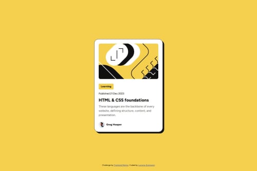
Blog-preview-card with HTML and CSS

Solution retrospective
I am proud that I could copy the Figma file and I think the code is readable. Next time I have to understand better the font-size units and how is the better way to use them in order to create a responsive design.
What challenges did you encounter, and how did you overcome them?I found it difficult to escale the font-size without @query. Ultimatly I used responsive units(em and rem) but I have to use @query for it to work
What specific areas of your project would you like help with?I am not sure which font-size measures are the best.
Please log in to post a comment
Log in with GitHubCommunity feedback
- P@Stroudy
Awesome job tackling this challenge! You’re doing amazing, and I wanted to share a couple of suggestions that might help refine your approach…
-
Using a
<main>tag inside the<body>of your HTML is a best practice because it clearly identifies the main content of your page. This helps with accessibility and improves how search engines understand your content. -
These
<div>should really have semantic tags like headings (<h1> to <h6>) and paragraphs (<p>) convey structure and meaning to content, improving accessibility, SEO, and readability by helping search engines and screen readers interpret the content.
<div class="card-tag"> Learning </div>-
Line height is usually unitless to scale proportionally with the font size, keeping text readable across different devices. Best practice is to use a unitless value like
1.5for flexibility. Avoid using fixed units likepxor%, as they don't adapt well to changes in font size or layout. -
Developers should avoid using pixels (
px) because they are a fixed size and don't scale well on different devices. Instead, useremorem, which are relative units that adjust based on user settings, making your design more flexible, responsive, and accessible. For more information check out this, Why font-size must NEVER be in pixels or this video by Kevin Powell CSS em and rem explained.- Another great resource for px to rem converter. -
Using
max-width: 100%ormin-width: 100%is more responsive than justwidth: 100%because they allow elements to adjust better to different screen sizes. To learn more, check out this article: responsive-meaning.
You’re doing fantastic! I hope these tips help you as you continue your coding journey. Stay curious and keep experimenting—every challenge is an opportunity to learn. Have fun, and keep coding with confidence! 🌟
Marked as helpful -
- @FranciscoMi
Great!!!. Practically identical to the original!.
For information. There is one thing that we usually make, and that is to put
*{
padding:0;
margin:0;
As you know, this is a way to reset margin and padding. So far so good
But I think it doesn't make sense to put padding:0 since, it doesn't do anything. I would remove it.
margin:0, on the other hand, is better aplied to the body. The elements that you put in the * are applied to all elements and occupies memory.
I think that's not good practice. I would write it like this
* {
box-sizing:border-box
}

body{
margin:0;
}
let me know. Best regards


Join our Discord community
Join thousands of Frontend Mentor community members taking the challenges, sharing resources, helping each other, and chatting about all things front-end!
Join our Discord