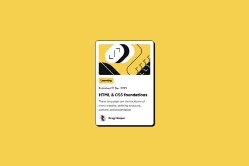
Submitted 6 months agoA solution to the Blog preview card challenge
Blog Preview Card with HTML and CSS

@juliabush
Code
Please log in to post a comment
Log in with GitHubCommunity feedback
- @Ashmawy21
Great work! Here's some feedback to help refine your design ;)
and ensure it aligns with the provided style guide:
1. Layout & Responsiveness:
- Current Design: The layout works well for the mobile view with a centered
maincontainer. - Improvement: While the design is centered, make sure to test the layout on various screen sizes (320px–1440px) to ensure it's fully responsive. Use media queries to adjust styles for different screen widths, especially for larger screens (desktop). For example:
@media (min-width: 768px) {
  /* Adjust layout for tablets and larger screens */
}
@media (min-width: 1440px) {
  /* Adjust layout for desktop */
}
2. Colors:
- Current Design: The use of yellow for accents and black text is on the right track.
- Improvement: Ensure you use the exact colors from the style guide:
- Yellow:
hsl(47, 88%, 63%) - White:
hsl(0, 0%, 100%) - Grey 500:
hsl(0, 0%, 42%) - Grey 950:
hsl(0, 0%, 7%)
- Yellow:
This consistency will ensure the design matches the provided style guide.
3. Typography:
- Current Design: The
Figtreefont is correctly imported, and font sizes are consistent for the most part. - Improvement:
- Adjust the body text size to
16pxfor readability, as per the style guide. - For font weights, ensure the following:
- For normal text:
500(light) - For headings and important text:
800(bold)
- For normal text:
- Example:
body {
  font-size: 16px; /* Set the font size to 16px for body text */
}
h1, h2, h3 {
  font-weight: 800; /* Use bold for headings */
}
- Adjust the body text size to
4. Spacing & Alignment:
- Current Design: The spacing is clear, but some areas could use more attention for visual balance.
- Improvement: Review the spacing around elements like the button, image, and avatar to ensure they are proportionate and aligned with the style guide. You can use the
gapproperty within flex containers for better spacing control.
5. Button Styling:
- Current Design: The button is functional, but its hover state could be more prominent.
- Improvement: Consider adding a hover effect for the button to make it more interactive and engaging:
.card__button:hover {
  background-color: darken(var(--clr-yellow), 10%); /* Make the button darker on hover */
}
6. Images & Alt Text:
- Current Design: The images are clear, but the alt text for both the main image and avatar is missing.
- Improvement: Add descriptive
altattributes to the images to improve accessibility:<img src="assets/images/illustration-article.svg" alt="Illustration of a blog article" class="card__main-image"> <img src="assets/images/image-avatar.webp" alt="Avatar of Greg Hooper" class="card__avatar">
7. Content Accessibility:
- Current Design: The content is clear, but ensure that it's fully accessible for users with disabilities.
- Improvement: Double-check that the contrast ratio between text and background colors meets WCAG requirements (at least 4.5:1 for body text). You might need to adjust the grey tones or background color for better readability.
8. Additional Suggestions:
- Avatar & Attribution: The avatar and attribution section is working well. Consider adding more spacing around the elements to improve visual clarity and ensure the text is not too close to the image.
- Text Clarity: Ensure that the card description (
card__main-description) remains legible by tweaking opacity if needed, especially when viewed on different backgrounds.
Overall: You’ve done a great job following the structure and creating a visually appealing layout. With a few tweaks to color accuracy, typography, spacing, and responsiveness, it will align perfectly with the style guide. Keep up the great work!
- Current Design: The layout works well for the mobile view with a centered

Join our Discord community
Join thousands of Frontend Mentor community members taking the challenges, sharing resources, helping each other, and chatting about all things front-end!
Join our Discord