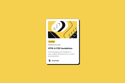
Submitted 2 months agoA solution to the Blog preview card challenge
Blog preview card with HTML and pure CSS

@andreaselmi
Solution retrospective
What challenges did you encounter, and how did you overcome them?
I had to understand a scalable way to define fonts that are different between mobile and desktop breakpoints.
I started with change font-size value of typography class with media query but later I changed this value directly in css :root
What specific areas of your project would you like help with?Feedback on the overall HTML structure (semantics and accessibility) and CSS configuration would be great :)
Code
Please log in to post a comment
Log in with GitHubCommunity feedback
- @MarziaJalili
All peachy! 🥳
🌟 Some tips?
✅ There is a shorthand property for settling the top and bottom margins:
/* Same values */
margin-block: 20px;

/* Different values */
margin-block: top bottom;
✅ The same could be applied for padding:
/* Same values */
padding-block: 15px;

/* Different values */
padding-block: top bottom;
I Literally failed to spot any mistakes, really impressive ! 😅
Marked as helpful

Join our Discord community
Join thousands of Frontend Mentor community members taking the challenges, sharing resources, helping each other, and chatting about all things front-end!
Join our Discord