
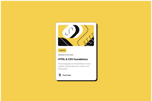
Solution retrospective
In this project, I used an SVG image as the container's background. This choice made it easy to keep the image height fixed, no matter how wide it gets, ensuring the design stays consistent on different screens.
The tricky part was making the font size change based on the screen width without using media queries. That’s when I discovered the clamp() function! With just one line of code, the text size became responsive, adjusting smoothly to different screen sizes. I’m excited to use this simple and powerful technique in future projects.
Please log in to post a comment
Log in with GitHubCommunity feedback
- P@nikolasladic
Amazing result! I will learn from this code as it is better then mine! :)

Join our Discord community
Join thousands of Frontend Mentor community members taking the challenges, sharing resources, helping each other, and chatting about all things front-end!
Join our Discord