
Solution retrospective
For this one, my prouds are mostly because the design being flat made me figure out most of what should I do in the design at first sight. About what to do next time... part of the code got scrambled because of inline svg.
What challenges did you encounter, and how did you overcome them?A challenge for me is more about sizing the content to get as close as possible to the original design. This actually can't be overcomed easily because it's more of a "try and error" situation.
Please log in to post a comment
Log in with GitHubCommunity feedback
- P@Stroudy
Amazing job with this! You’re making fantastic progress. Here are some small tweaks that might take your solution to the next level…
- These
<div>should really have semantic tags like headings (<h1> to <h6>) and paragraphs (<p>) convey structure and meaning to content, improving accessibility, SEO, and readability by helping search engines and screen readers interpret the content.
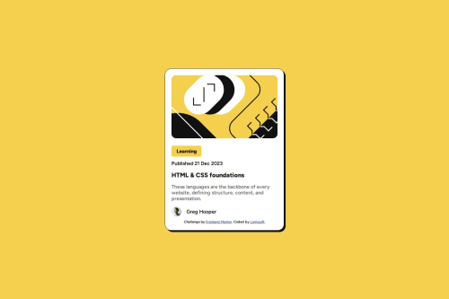
<div class = "tag">Learning</div> <div class = "date">Published 21 Dec 2023</div>-
Using
font-display: swapin your@font-facerule improves performance by showing fallback text until the custom font loads, preventing a blank screen (flash of invisible text). The downside is a brief flash when the font switches, but it’s usually better than waiting for text to appear. -
I think you can benefit from using a naming convention like BEM (Block, Element, Modifier) is beneficial because it makes your CSS more organized, readable, and easier to maintain. BEM helps you clearly understand the purpose of each class, avoid naming conflicts, and create reusable components, leading to a more scalable codebase. For more details BEM,
-
This does not matter that much at this stage but something to be mindful of for SEO(Search Engine Optimisation),
<meta>description tag missing that helps search engine determine what the page is about, Something like this<meta name="description" content="description goes here" />
You’re doing fantastic! I hope these tips help you as you continue your coding journey. Stay curious and keep experimenting—every challenge is an opportunity to learn. Have fun, and keep coding with confidence! 🌟
Marked as helpful - These
- @decorator-factory
- The card is not responsive. Because it's using a fixed width, it will overflow when there's not enough space. I would use a
max-widthinstead: hint the browser instead of forcing a specific value - The heading is a bit too small on desktop. It should be 24px (this way it is the main point of focus when someone is browsing a page). For the same reason the publishing date and the tag should be a bit smaller: they are secondary details. I also think the text is easier to read with a line-height of 1.5 on the description
- I'm not sure why the image is included as inline SVG. It's definitely better to include images as separate files (for caching, reusing the image, editing the image, and code readability)
- A small accessibility improvement would be using the <time> tag for the post date
- The card is not responsive. Because it's using a fixed width, it will overflow when there's not enough space. I would use a


Join our Discord community
Join thousands of Frontend Mentor community members taking the challenges, sharing resources, helping each other, and chatting about all things front-end!
Join our Discord