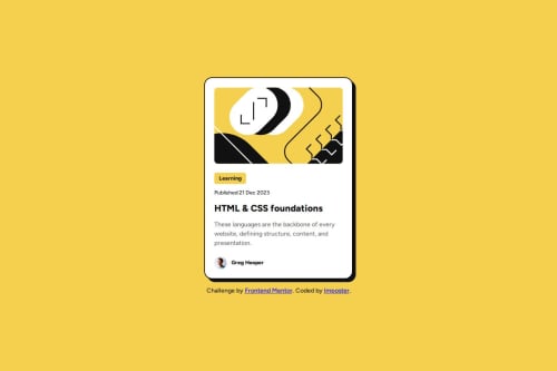
Blog Preview Card with HTML and CSS

Solution retrospective
Last time I didn't look at the figma files, this time around I looked at them from the start to try and get the solution as close as possible to the proposed design.
What specific areas of your project would you like help with?-
When trying to get the text content to fit properly in the card-content section, I had issues with the tag having a default margin. Am I supposed to remove this margin in order to get things to size correctly? Did I do this the right way by specifying 0 margin on all elements at the top of my css?
-
What are some better practices I could have followed with my CSS?
-
I tried to follow the design from figma as much as possible, but this resulted in a lot of pixel values being specified, which I don't think is great for resizing and responsive layout. What could I have done better here?
-
The challenge says: The font sizes in this project are slightly smaller in the mobile layout. Find a way to reduce font size for smaller screens without using media queries. I'd be keen to see how other people approached this. I know I could use vw units for the font size, but I don't know how to set the starting font size using pixels and then scale from there.
Please log in to post a comment
Log in with GitHubCommunity feedback
- @Diego2Drm<p class="text text-medium text-gray"></p>
Why put more than one class on the tag?
.text-small { font-size: 14px; }
.text-medium { font-size: 16px; }
.text-large { font-size: 24px; } you can use variables..
For example:
:root{ --text-large: 30px; }
h1{ font-size: var(--text-large); }
Marked as helpful

Join our Discord community
Join thousands of Frontend Mentor community members taking the challenges, sharing resources, helping each other, and chatting about all things front-end!
Join our Discord