Not Found
Not Found
Not Found
Not Found
Not Found
Not Found
Not Found
Not Found
Not Found
Not Found
Not Found
Not Found
Not Found
Not Found
Not Found
Not Found
Not Found
Not Found
Not Found
Not Found

Submitted

blog-preview-card-main

bea-jpg• 90

@bea-jpg

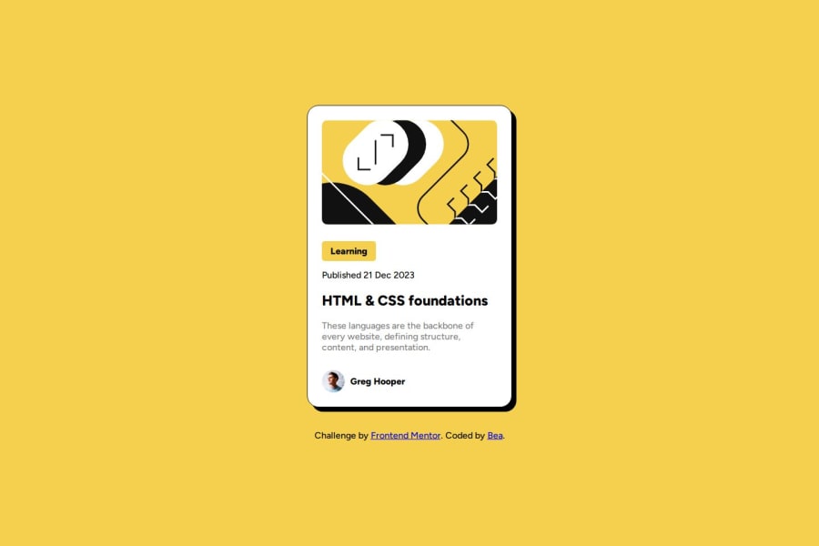
Desktop design screenshot for the Blog preview card coding challenge

This is a solution for...

  • HTML
  • CSS
1newbie
View challenge

Design comparison


SolutionDesign

Solution retrospective


What are you most proud of, and what would you do differently next time?

Working speed.

What challenges did you encounter, and how did you overcome them?

None

What specific areas of your project would you like help with?

None

Community feedback

P

@Islandstone89

Posted

Hey, well done. Here are some suggestions:

HTML:

  • Every webpage needs a <main> that wraps all of the content, except for <header> and footer>. This is vital for accessibility, as it helps screen readers identify a page's "main" section. Change .container to a <main>.

  • Wrap the date in a <time> element:<p>Published <time datetime="2023-12-21">21 Dec 2023</time></p>.

  • The heading would have a link as this is a blog card.

  • .attribution should be a <footer>, and you should use <p> for the text inside. It needs to be moved outside of the <main>.

CSS:

  • Including a CSS Reset at the top is good practice.

  • Add around 1rem of padding on the body, so the card doesn't touch the edges on small screens.

  • Move font-family, font-size and font-weight from * to body.

  • Move all the properties on .container to body.

  • Remove the width on .card and .category.

  • Add a max-width of around 25rem on the card, to prevent it from getting too wide on larger screens.

  • font-size must never be in px. This is a big accessibility issue, as it prevents the font size from scaling with the user's default setting in the browser. Use rem instead.

  • Add display: inline-block on .category, this prevents it from taking up the full width.

Marked as helpful

0
P
Eugen• 80

@psdesignro

Posted

Great job! The code is well structured and clean. It lookes like it's a bit narrower than the original, and the line-height for the description is smaller. Also according to the figma file, the author text font size should be smaller and the same on mobile and desktop.

0

Please log in to post a comment

Log in with GitHub
Discord logo

Join our Discord community

Join thousands of Frontend Mentor community members taking the challenges, sharing resources, helping each other, and chatting about all things front-end!

Join our Discord