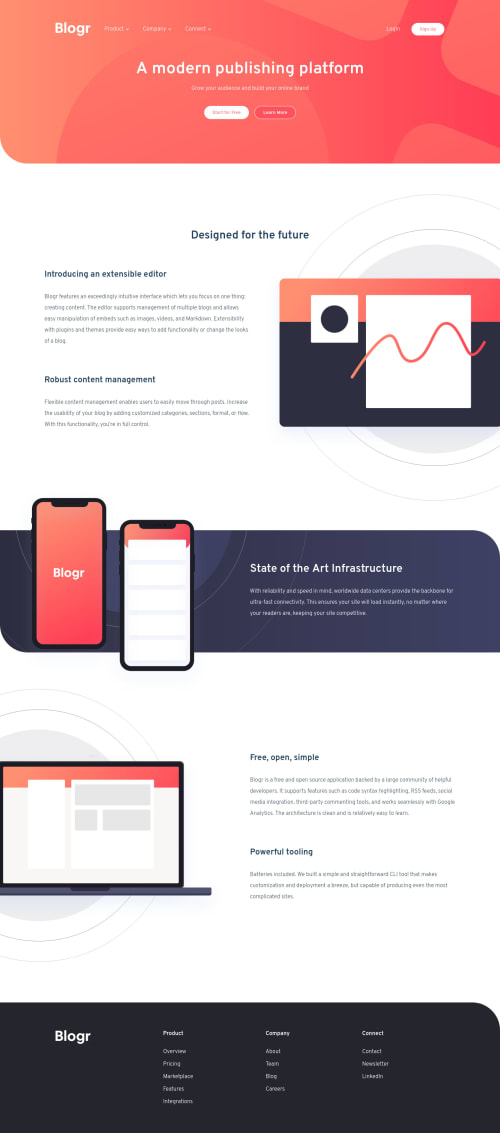
Submitted about 3 years agoA solution to the Blogr landing page challenge
Blogr Landing Page Solution
LVL 2

@evansanchez963
Solution retrospective
Is there anything I can do to improve the HTML, CSS, or JavaScript?
Code
Loading...
Please log in to post a comment
Log in with GitHubCommunity feedback
No feedback yet. Be the first to give feedback on evansanchez963’s solution.
Join our Discord community
Join thousands of Frontend Mentor community members taking the challenges, sharing resources, helping each other, and chatting about all things front-end!
Join our Discord