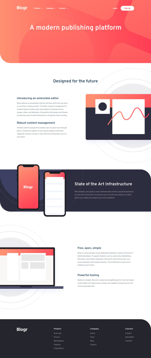
Blogr landing page solution with HTML, CSS, JS

Solution retrospective
Big s/o to @Yazdun, who gave me some tips about CSS animations. By the way, I guess I should go through SCSS, since my stylesheets begin to be veeery long ! I'm particulary happy about my .wrapper system, which avoid me to use Bootstrap. I think I'll reuse this .wrapper in the future. Feel free to take it, if you judge it relevant ! Also, this little tool helped me to crop .svg image.
Place to the questions, now :
- Can I inherit from upper
@mediaquery ? Or is it more secure to inherit from the original one ? - If I can't, what would be the best practice to position backgrounds without to use media queries, taking resizing in consideration ?
Background-position?I'm mostyl talking about white sections.
Hope you'll like it ! I had some fun playing with those kind of "breathing" effect ! I didn't spent much time in the .js, but it seems functional.
Please log in to post a comment
Log in with GitHubCommunity feedback
- @Yazdun
This motivates me to pick up this challenge 😃 layout is responsive and functional and looks very solid, If you need help on accessibility I'll be glad to help, You have some issues that I haven't encountered yet so maybe I can learn something myself, Your call anyway.
-
About media query question, only talking about inheriting from upper media query makes me confused, I have never seen it before but I'm not sure if it's possible, but even if it is, It doesn't sound like a good approach IMO.
-
About background issue I certainly need some help myself 😅
-
If you want to start using sass, here is a great folder architecture which saved me from a lot of headaches, there are so many folder structures out there but this one works for me the best. They also provide boilerplate which you can find here. If you were interested in this, I use same structure on my repo which has all the media query mixins based on freecodecamp's breakpoint guide, also I added
sr-only,hide-for-mobile,hide-for-desktopclasses and removed some default styles which saves me from lot of repetition in the long run, feel free to use it on your own projects. (here is the repo)
I hope this helps and keep coding 👏
Marked as helpful -
- @FlorianJourde
I will correct HTML issues tomorrow !

Join our Discord community
Join thousands of Frontend Mentor community members taking the challenges, sharing resources, helping each other, and chatting about all things front-end!
Join our Discord