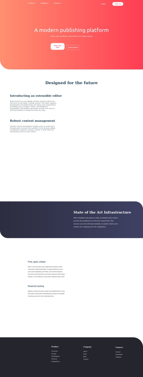
'Blogr' Landing Page using CSS & tiny JavaScript

Solution retrospective
What is your opinion on my CSS code? What exactly would you improve in my macaroni code :D ? What suggestions you have as a whole? Thank you
Please log in to post a comment
Log in with GitHubCommunity feedback
- @nicm42
I like your description of macaroni code :)
I opened this, wondered why it had so much white space and then realised it's because all your images are missing. You need to upload those to GitHub, as it currently can't find them.
Your Ubuntu font isn't showing up. It took me a while to spot it, but you've got an extra "-font" when you tell it the custom property to use: --ubuntu-font: "Ubuntu", sans-serif; font-family: var(--ubuntu-font-font);
Some of your CSS is repeated. So for example, main-para-one and main-para-two have exactly the same code. What you can do is to give both those paragraphs a class of main-para, so then you'd have this:
.main-para { font-size: 1.5rem; max-width: 48rem; color: hsl(207, 13%, 34%); margin-top: 3rem; }
What I've found useful, to make the CSS code easier to read, is to space it out a bit more - so leave a blank line beneath each closing curly bracket (like you have after root). And then label each section so it's easy to see on skimming eg
/**************** Header ****************/ .header { /* Some styles go here */ } .logo { /* Some more styles go here */ }
I don't know if you did it on purpose, but only your first dropdown menu works - because the JS is looking at the ID on the first one. If it looks at the class instead, then you can do all three. But that is a little more complicated, as the selector will get all of those lis and you have to loop through them to add/remove the active class when it's clicked.
Marked as helpful
Join our Discord community
Join thousands of Frontend Mentor community members taking the challenges, sharing resources, helping each other, and chatting about all things front-end!
Join our Discord